


 English (pdf)
 Article in xml format
 Article references
 Send this article by e-mail
 Cited by SciELO
  Similars in
SciELO
Similars in
SciELO 
 Permalink
I. Introduction and background
Population maps, which represent how the inhabitants of a given territory are distributed, are one of the most commonly produced thematic maps (Wiegand, 2003). Traditionally, geographic population distribution is displayed using a choropleth map, which uses shaded colours or patterns to represent the value of a statistical variable and helps with the geographical interpretation of otherwise complex datasets (Raisz, 1962). However, choropleth maps can be misleading as the value attributed to each polygon is across the entire area of each mapping unit, which is seldom the case, and changes only occur at polygon boundaries in an abrupt manner (Coulson, 1987). Consequently, results are highly dependent on how polygons are designed and on the selected symbolism, something which can lead to deceptive impressions of how the population is distributed (Openshaw & Taylor,1981).
In order to minimise this issue, cartographers have come up with several solutions. For example, one way of fine tuning where population is located is the use of population density instead of the absolute number of inhabitants, as by doing this the reader can get a better grasp of how the population is distributed across the polygon (Dixon, 1972). Additionally, a variant of population density maps is the use of dot maps, where dots representing a certain amount of people are placed at random within each polygon providing an easy way of visualising population concentrations (Lavin, 1986). Other possible alternatives are dasymetric maps, where instead of representing population across an area regardless of where housing is located, land use is taken into account in order to represent where people actually live, avoiding in this way fictitious situations such as people living on lakes or glaciers (Eicher & Brewer, 2001; Holt & Lu, 2011; Martins et al., 2012; Petrov, 2012).
Another way of representing population distribution that has gained popularity in the last decade is by creating population grids (Huang et al., 2019). Population grids do not represent population using a vectorial model of the world constrained by administrative limits, but rather use a continuous or raster model where population changes through space in a smoother manner (Goerlich & Cantarino, 2013). In order to create them, land use data extracted from satellite or aerial imagery is combined with population data, and this way the modifiable aerial unit problem (Openshaw & Taylor, 1981) is avoided (Batista & Silva et al., 2013). It is therefore not surprising that some multinational institutions such as the European Union have embraced gridded population maps, as they are a way of smoothing out administrative differences between regions and countries (Eurostat, 2021). The Instituto Nacional de Estadística (INE), also embraced the gridded approach with the 2011 census, as they generated a 1km2 grid for Spain which includes data for all cells where at least one housing unit is present. This gridded dataset was used by Eurostat to create the aforementioned European gridded population map (Instituto Nacional de Estadística [INE], 2011).
However, perhaps the most straight forward way of improving the resolution of population maps is using a standard choropleth map but augmenting the level of detail - that is reducing the polygon size. Using the USA as an example, one can represent population at the national, state, county or local level, which will provide an increasing level of detail while changing how the map is interpreted by the reader. Nevertheless, obtaining ever-increasing detail when it comes to population figures is not equally possible across the world, as while some countries produce population counts at different resolutions down to neighbourhood level (Campanera et al., 2014), others do not offer such detailed information, making the production of detailed population maps a challenging task.
In the case of Spain, detailed population figures have traditionally been given at the municipal - local - level (Pampalon et al., 2009), which for many uses and applications is too coarse, as municipalities can be larger than 1500km2 (Gajardo et al., 2014) and can include hundreds of unevenly sized settlements. This means that in the picture given when using a municipal level of scale less populated areas may be masked by larger settlements within the same local authority, conveying misleading information. There are, however, alternatives which enable the representation of the population, whether absolute or density, at sub-municipal level. This article uses the case of Galicia to present a comparison between four different levels of detail which enable the representation of population density at local authority level, census tract and traditional parish level. It starts by explaining how population data is provided in Spain and Galicia, it continues by developing a new method to represents population density at settlement level as a choropleth map, and represents and analyses the generated cartographic outputs, the most detailed population density map available for Galicia.
II. Population data in Spain and Galicia
The reason why the most detailed population maps of Spain have traditionally been at the municipal level is because population counts are carried out by local authorities - using a register known as padrón - and once a year they send their population data to the Instituto Nacional de Estadística (INE) (Jurado, 2004). Once the INE has received data from all municipalities, it collates it and publishes the latest population figures for Spain (Goerlich, 2007). Consequently, the only annual population count available in Spain is at municipal level and not at greater levels of detail. In the year 2015 Spain was divided into 8125 municipalities (Cabezuelo-Lorenzo et al., 2016), which means that the average local authority size was of around 62km2 and had an average population of just over 11 000 people. However, due to historical, political and demographic reasons there is a very large variability in terms of size, population and their distribution across Spain (Rivero & Lladós, 2014). This disparity means that the cartographic representation of population distribution can often be misleading, as very different types of municipalities are all mapped using the same method.
The issue is the same across the country, but the case of Galicia, a historic nationality which currently is one of the seventeen Autonomous Communities of Spain (Rodríguez, 2016), is particularly relevant. It has the highest density of inhabited settlements in Spain (Barbosa-Brandão et al., 2015) with almost half of Spain’s total (Goerlich & Cantarino, 2011) in an area which represents less than 6% of the country’s surface and population. The Galician population is therefore very dispersed when compared to other areas of Spain, but administratively in the year 2015 it only had 314 municipalities - locally known as concellos - (table I) which represent less than 4% of Spain’s total. Therefore, when mapping population in Galicia at a municipal level the picture given can be misleading, as less populated areas may be masked by large settlements within the same local authority.
Up until recently it was difficult to easily obtain more detailed population data, but with the progressive popularisation of GIS software and the drive towards opening and facilitating official data to the public, sub-municipal population data has become available, allowing alternatives to the traditional municipal level of detail. In the Galician case, three sub-municipal levels of detail can be used to represent population: census tracts, traditional parishes and settlements (fig. 1).
Table I Descriptive statistics of the different administrative divisions of Galicia by province and totals.
| Administrative division | Variable | Province | Galicia | |||
|---|---|---|---|---|---|---|
| A Coruña | Lugo | Ourense | Pontevedra | |||
| Province | Population | 1 128 694 | 338 921 | 318 739 | 948 302 | 2 734 656 |
| Surface (km2) | 7958 | 9860 | 7274 | 4496 | 29 588 | |
| Population density (hab/km2) | 142 | 34 | 44 | 211 | 92 | |
| Local authority (LA) | Count | 93 | 67 | 92 | 62 | 314 |
| People per LA | 12 136 | 5 059 | 3 465 | 15 295 | 8 709 | |
| Average surface (km2) | 85.6 | 147.2 | 79.1 | 72.5 | 94.2 | |
| Census tract (CT) | Count | 920 | 298 | 283 | 748 | 2249 |
| People per CT | 1227 | 1137 | 1126 | 1268 | 1216 | |
| Average surface (km2) | 8.6 | 33.1 | 25.7 | 6.0 | 13.2 | |
| Number per LA | 10 | 4 | 3 | 12 | 7 | |
| Parish | Count | 939 | 1271 | 917 | 664 | 3791 |
| People per parish | 1202 | 267 | 348 | 1428 | 721 | |
| Average surface (km2) | 8.5 | 7.8 | 7.9 | 6.8 | 7.8 | |
| Number per LA | 10 | 19 | 10 | 11 | 12 | |
| Settlement | Count | 9779 | 8989 | 3531 | 6044 | 28 343 |
| People per settlement | 116 | 38 | 90 | 157 | 96 | |
| Average surface (km2) | 0.8 | 1.1 | 2.1 | 0.7 | 1.0 | |
| Number per LA | 105 | 134 | 38 | 97 | 90 | |
1. Census tracts
Census tracts are used by the INE in order to carry out the census data collection every ten years and they are designed to facilitate the process and to be as homogeneous as possible population wise, so they are roughly similarly sized in terms of population with a recommended maximum of 2500 people per tract, while keeping municipal borders unaltered (Instituto Nacional de Estadística, 2015). In the Galician case, in the year 2011 there were 2249 census tracts (table I). In practical terms this means that most municipalities which are less than 2500 people will consist of one census tract only, which will exactly coincide with the municipal limits, while in more populated local authorities the total area is split into smaller units. The consequence of this is that while in rural and less populated local authorities’ census tracts tend to be the same size and shape as municipal boundaries, in densely populated municipalities such as cities there can be hundreds of them, allowing for a more detailed population representation. This disparity has a cartographic consequence when displaying population related data, as there is a clear concentration in urban areas. Therefore, when the whole of Galicia is represented using graduated colour symbols on a choropleth map, most areas appear as sparsely populated due to the very high density of census tracts within cities.
2. Parishes
Parishes - known as parroquias in Spanish and Galician - are the traditional sub-municipal divisions into which Galician local authorities are divided and, although they are not fully officially recognised, inhabitants tend to have a strong sense of belonging (Tolosana, 2004). Contrary to census tracts, parishes in Galicia can be used to represent the rural population in a more detailed way, while urban areas are more coarsely displayed. In the year 2015 there were 3791 official parishes in Galicia (table I), which means that on average each municipality had around 12 parishes, but values vary dramatically from town to town. Therefore, a parish population map will provide a level of detail for rural areas which is not achievable by using census tracts.
3. Settlements
Settlements are officially known as Singular Population Entities - Entidad Sigular de Población in Spanish - and are defined by the INE as “any habitable area of the municipal terminality, inhabited or exceptionally inhabited, clearly differentiated within the same and which is known by a specific denomination that identifies it without possibility of confusion” (INE, 2017a). Therefore, any group of buildings which can be potentially inhabitable and is separated from other groups of buildings is considered an independent settlement, even if nobody currently lives there permanently. The number of settlements varies yearly as new dwellings are built and demolished, but in the year 2015 Galicia had over 28 000 inhabited settlements, which given its size, it is an astonishing number as it roughly equals to one settlement per square kilometre (table I), a value eight times higher than the Spanish average. Therefore, settlements are the minimal population unit with which Galicia - and Spain - can be mapped using official data, but due to their small size, variable number, and unofficial status, there are no boundaries linked to each settlement, just latitude and longitude coordinates associated to their centre are provided by official sources (Centro Nacional de Información Geográfica [CNIG], 2015). Other ways the INE refers to settlements is as Nomenclátor or Unidad poblacional, with information about them provided directly by each local authority.
III. Methods
Four population density maps for each administrative division - municipal, census tracts, parishes and settlements - plus a standard guide map with Galicia’s main cities were produced to illustrate how each different division influences the way in which the population is represented.
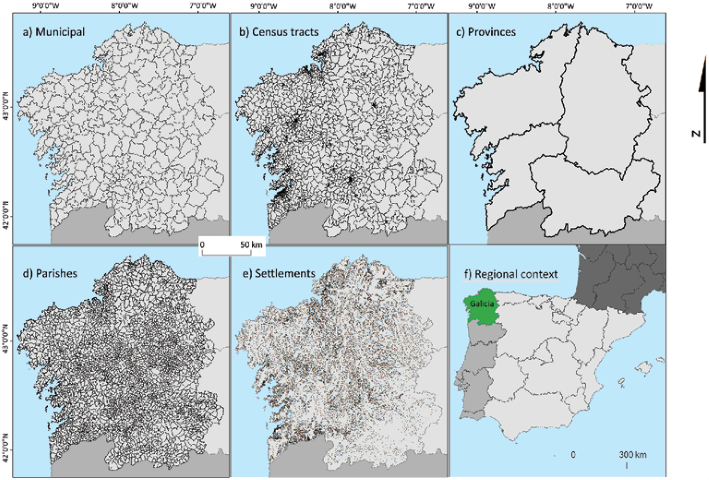
Fig. 1 Administrative limits of Galicia at different levels of scale. Source: IET (2011) and INE (2017a, 2017b, 2017c and 2017d)
1. Municipal and census tracts
Municipal divisions were obtained for the year 2015 from the Instituto Geográfico Nacional (IGN) official cartography (CNIG, 2017) and population data from the INE’s official population figures for January 2015 (INE, 2017b). Since both are official sources, each polygon representing a local authority has a statistical code which matches with the INE’s population dataset, so a simple join between the shapefile’s attribute table and the population dataset is enough to create the population map.
Census tract data was produced as part of the 2011 census process, so contrary to the other datasets used in this research, all cartographic (INE, 2014) and demographic (INE, 2017c) information refers to that year, and not 2015. However, it was decided that even if four years older, census tract data as provided by the INE (INE, 2017c) was comparable to the other datasets used as part of this paper. Even if not ideal, this does not represent an insurmountable issue, as during the 2011-2015 period Galician population has remained relatively stable with an overall population change of -1.4% (INE, 2017d). Just as with the municipal dataset, both cartographic and demographic data had a field in common with a numerical value for each census tract, so a simple join by attributes was performed to create the population map.
2. Parishes
Contrary to the other administrative divisions, parishes do not have a fully official status, so instead of using national data providers it was necessary to obtain the data from regional institutions. The Instituto de Estudios do Territorio (IET), part of the regional government, provides data at parish level, but it is quite dated as both demographic figures (Instituto Galego de Estatística [IGE], 2002) and the cartography associated to it (IET, 2011) are from the year 2001. Although there is population data available from more recent years (IGE, 2017), this information is not as accessible and, since 14 years have passed between 2001 and 2015, parish limits have changed in places, increasing the difficulty of linking population data with its corresponding parish. It was therefore decided that the best compromise was to use the available 2001 parish limits and the settlement population dataset, which is delivered as points with a population value attributed to them. By performing a spatial join based on location and adding all the population of the points which fell within each parish limits the total population for each parish in the year 2015 was established and mapped. On average each parish contained 7.5 settlements; with eight of them having 50 or more contained within their borders.
3. Settlements
While information about settlements has been traditionally provided as part of the national gazetteer - nomenclátor in Spanish (IGN, 2017), having population data associated to each settlement is more recent. The dataset is provided by the IGN by combining information from, among others, the Local Entities Register - collated by the Ministry of the Finance and Public Administrations, the INE and the cartographical data base of the IGN (CNIG, 2015). The dataset is available to download as a Microsoft Access Database or as an OpenDocument Database and includes a table named “entidades” where the information used in this paper is held. The “entidades” table contains a list of 153 125 settlements with information including a statistical code, name, province, population and X-Y coordinates which use the ETRS89 system. However, the given number of settlements does not match the number of settlements provided by other sources, which give a figure of around 60 000 (Comins & Moreno, 2003). Although this source has been superseded by an increase in the quality of the data provided by the INE in recent years, the dataset provided by the INE still has an excess number of settlements. The issue with the original dataset is that some settlements are introduced multiple times because they are classified using different denominations, such as municipality, local authority seat and settlement, multiplying the population and number of settlements. In order to eliminate said duplicities, all cases with a statistical code ending in zero - while being careful to not include those which ended in 10, 20, 30 or 40 - were eliminated, as they are duplications. To check that the process was correct, the total population per local authority was added and compared with official population data from the INE, with positive results for the Galician case and a total population discrepancy of 0.06% for the Spanish case. Finally, all those settlements with a population of 0 were deleted (Comins & Moreno, 2003) as they could be abandoned houses, holiday accommodation or new settlements with no inhabitants yet. This left a total of 64 224 populated settlements in Spain with known coordinates, as those without given coordinates could not be mapped, of which 28 307 pertained to Galicia. It is important to note that all population types - cities, towns, villages, hamlets, etc. - and regardless of their size are considered a settlement.
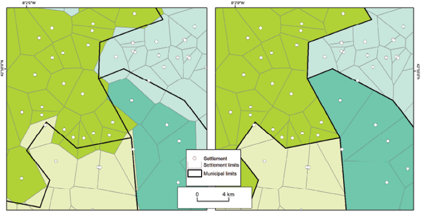
The biggest issue when working with settlements, however, is mapping them as a choropleth map in order to allow a comparison with all other administrative divisions, as since they have no official limits no cartography exists which defines them, so they are just points without surface. It is therefore necessary to create a bespoke cartography which represents some 2D limits, even if not official but purely geometrical. The first step to achieve this is to convert the X-Y coordinates into a point layer and to split it by the town they belong to. If a municipality only has one settlement, the settlement limits are those of the town, so no more processing is required, but only two cases were found in Galicia in which this was the case. Those local authorities which have three or more settlements within their limits - in the Galician case, there are no local authorities with only two settlements - need a more complex method in order to convert punctual information into a choropleth map. While in the past interpolation methods have been used to convert settlement data values into a population raster (García González & Cebrián Abellán, 2006), this produces results which are difficult to compare with the other sub-municipal divisions, so it was decided to use a fully vector based methodology in order to provide results in the form of a choropleth map (Nobajas & Nadal, 2015). The method consists in splitting the settlements shapefile into 312 new shapefiles, one per municipality, and also splitting a municipal shapefile into the same number of new shapefiles where only the border of one local authority is stored. The next step is to create Voronoi - also known as Thiessen - polygons (Albrecht, 1998) for each of the files containing settlement data with the purpose of converting punctual data into polygon data. Afterwards each of the new polygon shapefiles composed by Voronoi polygons is clipped using its corresponding municipal boundaries and finally all the resulting polygons are merged together to generate a continuous map for all of Galicia.
This method, while being computationally demanding and more complex to perform, provides a final result which is directly comparable to the other administrative divisions, as they all use polygons. Other tested forms of representation, such as proportional symbols, did not deliver such good results due to the uneven density of settlement locations across the study area, but also to the sheer quantity of them. Punctual methods of representation produced very high levels of cartographic noise which impeded reading the maps clearly, while by using the method explained here the final result is much clearer and spatial trends are easily observable. It should be also stressed that the resulting map is just a mean of representing population data, not an administrative map, as settlements are provided as points by the INE because there are no administrative divisions associated to them.
4. Visualisation methods
In order to compare the four different maps, it was deemed best to represent population density rather than absolute population figures as it allows for an easy comparison between population datasets which have dissimilar ranges of maximum and minimum values. In Galicia the average population for municipalities is almost 9000, while for settlements it is less than 100, so comparing both administrative divisions directly could be misleading. Population density was measured by dividing the population contained in each polygon by its surface area, but while official surface figures exist for municipalities, other sub-municipal units do not have them and have to be calculated using GIS, so for the sake of consistency it was decided to use calculated figures in all the maps, even when official figures existed.
Once all population density figures for all maps were obtained, it was observed that, as expected, population density ranges between all the maps were highly different. For example, census tracts tend to have similar populations and a very varied surface due to the way they are designed, while municipalities and settlements can have very different populations but similar areas, making population density figures very different and comparisons difficult. In order to minimise this and enhance the comparison between maps, it was decided to rank population density and represent it using quintiles (Smith, 1986). By displaying information in this way polygons are divided into five equal groups each representing 20% of the administrative divisions ordered by population density (Pampalon et al., 2009). The result of using this method is that maps are then directly comparable and the different characteristics of the different divisions are minimised since a common scale can be applied to all maps.
IV. Results and discussion
Thanks to the proposed method it is possible to compare the population density at different levels of detail at a glance and in an easily comparable way (fig. 2). Although total population numbers are the same in all four cases, changing the way administrative limits are defined provides very different visualisations, not only due to the different levels of granularity, but also due to the modifiable areal unit problem (Openshaw & Taylor, 1981). Representing population at municipal level, although being the most common manner of doing so, is too coarse to illustrate with the necessary level of detail how population is distributed, as the areas are usually too large and may encompass a variety of settlement types, from cities to tiny hamlets, all within the same administrative limits.
The influence that the modifiable areal unit problem has in how population density is represented is quite clear if the population is represented by using census tracts or parishes, as they have a relatively similar number of individual units - 2249 and 3791 respectively - yet they produce very different results. Due to their nature, census tracts are much denser in cities and urban areas as they are designed not to go above certain population numbers, while in rural areas they often share boundaries with municipal limits. The consequence of this is that when using quintiles, the region looks quite depopulated, as higher densities are all found in urban centres, while rural areas have the lowest values. On the other hand, parishes are more similar in size between them, so population density is represented in a very different way, one which is perhaps more similar to the municipal distribution but with a greater level of detail.
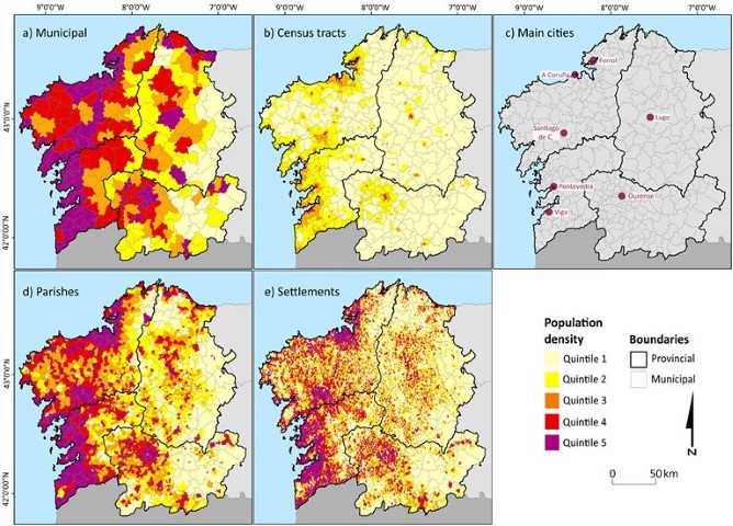
Fig. 2 Population density of Galicia using quintiles and different administrative divisions. A map highlighting the location of the main cities was included for reference. Source: INE (2017a, 2017b, 2017c and 2017d), IGE (2002) and IET (2011)
It is however by using settlements that the most detailed population distribution can be observed for the first time. Since the population is represented using over 28 000 individual polygons, each corresponding to a settled unit of population, the modifiable area unit problem is greatly minimised, as they represent the smallest unit for which population data can be obtained. This allows the observation of population patterns previously hidden by using other administrative divisions, while allowing a clearer understanding of the hidden complexity of population distribution. As figure 2 shows, all four population density maps show very different patterns which will convey a different type of information to different readers.
The different ways in which population representation is perceived also has a scalar dimension, as using different scales provides new interpretation possibilities. For instance, Lugo, one of the four provincial capitals and one of Galicia’s largest cities with a population of around 100 000 people covers an area of over 330km2 which can be divided into either 71 census tracts, 54 parishes or 302 settlements. Due to its large population it is on the top quintile for population density at the municipal level, but its internal population density is not equally spread across its area, as there are important variations within its borders. As figure 3 shows, its population distribution is very complex with a mosaic of different population densities spanning across all quintiles, something important when making planning choices or providing services, hence sub-municipal divisions allow us to understand the population distribution much more accurately.
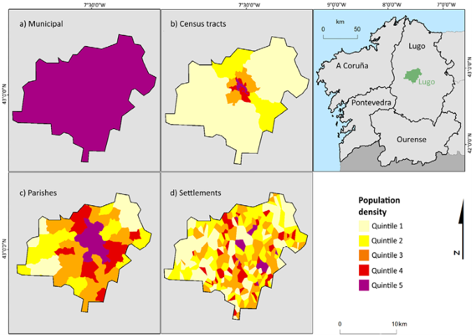
Fig. 3 Lugo’s population density using different administrative boundaries. Source: IET (2011), IGE (2002) and INE (2017a, 2017b, 2017c and 2017d)
Sub-municipal complexities are not limited to cities, as smaller townships also present big population differences within their borders. As an example, the town of Guitiriz has a population of almost 5500 people and a surface of almost 300km2, so consequently it has a lower population density which places it in Galicia’s second quintile. It can also be divided into six census tracts; of which all, bar one, are at the lowest population density quintile. If the population is divided using its 18 parishes a clearer trend appears due to the towns’ rurality, but it is only when the around 300 settlements are mapped that a precise representation of how the population is distributed emerges (fig. 4). Thanks to the use of settlement level data, it is possible to easily observe where the population concentrates within the municipal boundaries.
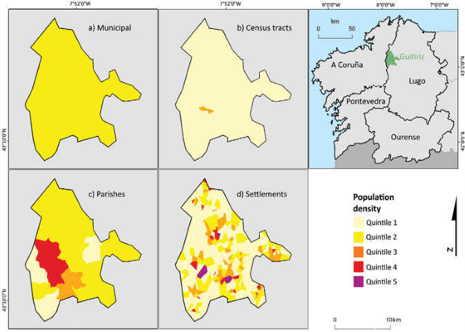
Fig. 4 Guitiriz’s population density using different administrative boundaries. Source: IET (2011), IGE (2002) and INE (2017a, 2017b, 2017c and 2017d)
While other more straightforward methods such as interpolation (García González & Cebrián Abellán, 2006) or a direct creation of a Voronoi diagram could be used, the results would differ. For example, as figure 5 shows, if Voronoi polygons are created without considering the municipal limits, polygons from different local authorities can become mixed, providing less accurate information, which at the level of scale achieved by working with settlements can become an issue. This makes a big difference, as it constrains the settlement limits to the municipal limits, adding an additional level of rigour.
Other methods used to avoid or minimise the modifiable area unit problem, such as dasymetric mapping or population grids, can be used in conjunction or as an alternative to the proposed method, although the advantage of the one presented here is that it does not rely on further datasets, it is self-contained to official data sources. Both dasymetric maps and population grids require combining land use data with population data (Goerlich & Cantarino, 2012), while here a similar result can be achieved by exclusively processing the initial datasets. However, the application of the proposed method is limited to those cases where there is a need to represent population entities that have no defined geographical limits. Due to its historic and geographic characteristics, the Galician case is a prime example of this, as it would be the whole of Spain due to the way official population data is distributed, but it may not be applicable to other regions or countries unless they offer similar datasets.
V. Conclusions
Due to the way in which population data are gathered, working at sub-municipal population level in Spain and other locations can be challenging, but in certain areas it is of paramount importance as data aggregated at the municipal level is not always fit for the purpose. Even when sub-municipal population data are available, such as census tracts or parishes, they can provide unsuitable results due to their nature, which can put too much weight on urban or rural areas. Therefore, the developed method, which allows converting very detailed settlement data into a choropleth map, has enabled the mapping of Galicia’s population with an unprecedented level of detail.
The process, however, is not without its challenges, especially if it is to be expanded across all of Spain or other countries. Due to the ever-changing nature of municipal and sub-municipal limits, new local authorities can be created while others eliminated, which exacerbates the difficulties working with data from different sources or years. Furthermore, in this case, settlement data is not provided ready to use, so significant amounts of tinkering are required in order to map it. At times it is not possible to fix all of these issues, which may lead to errors in the data, but fortunately they represent a very small percentage of settlements and/or population. Finally, the provided coordinates for settlements are at times either not correct or not sufficiently precise, which means that some settlements may end up in a different municipality when performing a spatial join with a municipal polygon vector file. Again, fortunately this only occurs in a very small minority of cases which can often be manually fixed.
Thus, even if challenging at times, the presented method allows the visualisation of how population is distributed using four different administrative divisions allowing the direct comparison between them, something which had not been achieved before. This should start a debate about which is the most suitable way of representing the population of an area with such a large amount of settlements, as no single representation is suitable for all purposes. Additionally, the creation of fictional limits can be controversial, as information which is mapped has a tendency to be considered true (Monmonier, 2018), which could lead to territorial conflicts, so it is important to make it clear that they are theoretical borders which have no legal or historical standing.

