


 Inglês (pdf)
 Artigo em XML
 Referências do artigo
 Enviar este artigo por email
 Citado por SciELO
  Similares em
SciELO
Similares em
SciELO 
 Permalink
1. Introduction
Many people who interact with everyday products experience situations that interfere with their level of satisfaction. In fact, different studies focused on use interaction processes have been developed (Unruh & Canciglieri Junior, 2018) and, despite there being a consensus that product design should meet users' expectations, there is still a lack of investigations that explain how attributes inherent to product design can influence emotional response and perceived usability. Among the various attributes of product design, colour stands out, which is based on the perception, or phenomenon of receiving a stimulus, through the visual sense, and processing information, attributing meanings to it (Moreira da Silva, 2013). The perception of colour can be influenced by physiological, cultural, age, gender, and other factors, which generate cognitive reactions in users, influencing their emotional sensations and behaviours (Heller, 2017). Therefore, colour can interfere with the perception of product composition elements, such as volume, weight, size, temperature, texture and others, which results in different emotional responses (Csillag, 2015). In general, the theoretical understanding of how the colour of a product influences emotion has already been discussed by Na & Suk (2014), Ding et al. (2021) and Alves et al. (2022); and also in the usability domain by Sonderegger & Sauer (2010) and Bonfim et al. (2023). On the other hand, there are still few empirical studies that analyze the influence of colours on product design, from the point of view of emotional responses and perceived usability. The present study aimed to analyze the influence of colour on the emotional response and perceived usability, during the interaction of senior adult females, with everyday products with the same practical function, but with different colours. This has allowed the authors to understand which aspects of interaction contribute to improving users' interaction with products.
2. Material and Methods
2.1. Characteristics and Ethical Aspects
The present study is characterized as inductive and descriptive/exploratory. The independent variable is colour applied to everyday products. The dependent variables are emotional response and perceived usability. The ethical aspects met the principles of integrity, proportionality, confidentiality, privacy and data protection (including anonymization and coding). Furthermore, an Informed Consent Form (in Portuguese language) was applied.
2.2. Sampling
Sampling was characterized as convenience and non-probabilistic. The inclusion criteria were: women between 60 and 80 years old; failure to report vision problems; the report of experience using the object of study; and not participate in professional activities in the area of Design. Such criteria guaranteed real experience in using the object of study, strengthening the precepts of specificity of users and tasks, in addition to limiting the judgment required in the protocols (dependent variables) to the colours of the products (independent variable). The sample size was defined as n=30, following the precepts of Serdar et al. (2021). Therefore, 30 women participated, with an average age of 66.27 years (s.d. 4.41 years).
2.3. Object of Study
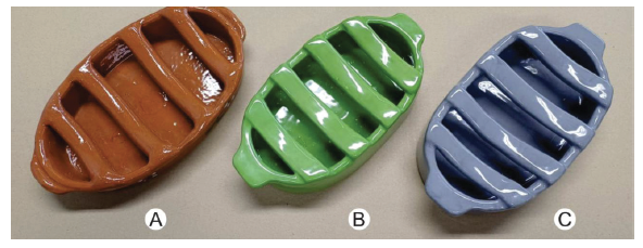
The object of study is a traditional Portuguese clay sausage roaster (Figure 1), shaped like a “boat” (where ethyl alcohol and grape marc spirit for the flame is deposited); and transverse rods (where the sausage is deposited), being produced by hand in brickworks and presenting a glazed finish. The definition of this object of study was previously planned and was directly related to the definition of the sample, as it is strongly present in Portuguese gastronomic culture. Therefore, it presents a hedonic relationship with senior adults users. According to Haaksma et al. (2018), emotional and usability evaluations are more easily applicable to hedonic products, when compared to utilitarian products, which corroborates this methodological option. The predominant colour of this product on the market is “terracotta” [NCS S 4050-Y60R] (Figure 1-a), but for the present study, products were developed in two other colours: “Green” [NCS S 2050-G30Y] ( Figure 1-b) and “Grey” [NCS S 4010-R90B] (Figure 1-c).
2.4. Protocols
The following research protocols were used:
Emotional Response Cards (ERC), a non-verbal self-report instrument adapted from PrEmo-2 (Desmet, 2018), composed of 14 cards, with representations of emotions with positive valences (Desire, Satisfaction, Pride, Hope, Joy, Admiration and Fascination) and negative valence (Disgust, Anger, Sadness, Fear, Shame, Borebom and Contempt);
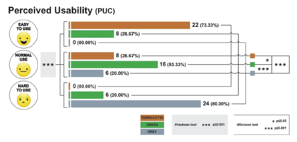
Perceived Usability Cards (PUC), a verbal and emoji self-report instrument, adapted from the Likert scale with three anchors (Bonfim et al. 2023), with the verbal information “easy to use”, “normal use” and “hard to use” (in the native Portuguese language) and a consonant emoji (Alismail & Zhang, 2020).
2.5. Methodological Procedures
Interaction activities occurred voluntarily and individually (Figure 2), with prior application of the ICF. The sequence of presentation of products, ERCs and PUCs was randomized. Initially, it was reported that, although the products were similar in shape, they were different in colour. This perception was confirmed by each of the participants, who reported having already used their primary function (sausage roaster). With the availability of the ERCs, an oral instruction explained how, arbitrarily, the cards should be associated with the colours of the products. At least a single card must be associated with each of the three products; and there were no limits on the number of cards per product.
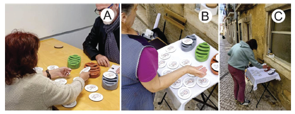
Figure 2 Interaction activities, with application of the ERCs, developed on the [omitted for blind review] premises (A); and in a traditional district of the [omitted for blind review] city (B and C) (Source: the authors).
At the end of the association, a photographic image guaranteed the record for data tabulation. After removing the ERCs, the PUCs were presented, with similar instructions and the express need to associate each card with a single colour. At the end, a photographic image ensured the record for data tabulation, completing the data collection stage. In general, all participants demonstrated interest and understanding with the instruments and procedures. After tabulating the data, descriptive statistical analysis was applied to obtain the frequency and relative percentage of the dependent variables. The Cochran's Q test (p < 0.05) was used to compare the degree of heterogeneity of RCTs given its property in comparing the proportion of categorical dichotomous responses (Aslam, 2023). In addition, the McNemar's test was used, indicated to compare responses of the same participants when exposed to different stimuli, expressed through paired binomial data (Pembury Smith & Ruxton, 2020). The degree of association between the ERCs was verified using Cramer's V coefficient, whose results close to zero suggest the absence of associations between the ERCs; and V > 0.25 indicate a strong degree of association (Akoglu, 2018). Regarding the PUC results, the Friedman test was applied to verify the heterogeneity of responses for different colours, as it compares different samples of paired data, expressed through ordinal responses (Comerlato et al., 2020). As a post hoc test, the Wilcoxon test (paired) with Bonferroni Correction was used, comparing the responses attributed to pairs of colours, since they came from the same participants.
3. Results
The ERC results, in frequency and relative percentage (Figure 3), indicate that three emotions with a positive valence (Desire, Hope and Joy) and four emotions with a negative valence (Disgust, Anger, Shame and Contempt) were sensitive to the participants' emotional perception. (p ≤ 0.05 - Cochran's Q test), confirming that colour was the factor that influenced this association. The degree of association between the ERCs indicated a value of V > 0.25. (Cramer's V coefficient) only among Shame and Contempt cards. The other associations presented V close to zero, demonstrating some independence in the choice of ERCs and indicating that the choice of a card does not necessarily imply the choice of another card together, reinforcing that the instrument was suitable for the present study.
The results of the PUC, frequency and relative percentage (Figure 4) confirm that the perception of usability was significantly (p ≤ 0.05 - Friedman test and Wilcoxon test) influenced by the colours of the products (independent variable).
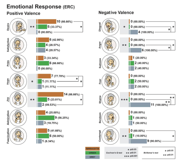
Figure 3 Emotional Response index, described in frequency (and relative percentage) for each of the emotions and each of the colours (Source: the authors).
4. Discussion
The design of a product can be considered one of the most important elements that influence use interaction, impacting (positively or negatively) users' emotional responses and perceived usability. Its physical structure, made up of numerous attributes, among which colour stands out, is what materializes the user interface. The present study, of an empirical nature, aimed to analyze the influence of colour on the emotional response and perceived usability of users, during the interaction with a product for everyday use.
In general, the results indicate that, in relation to emotional response, the colours of the products were decisive for the significant differences (p ≤ 0.05 - Cochran's Q test). In this case, in the emotions Desire, Hope and Joy (positive valence), the terracotta colour product was significantly (p ≤ 0.05) better evaluated than the grey colour, with the same difference occurring (p ≤ 0.05) in relation to the green product. Regarding the emotions Disgust, Anger, Shame and Contempt (negative valence), the product in grey colour was significantly (p ≤ 0.05) worse evaluated when compared to products in terracotta and green colour (this last comparison is not observed in the Contempt emotion), being highly significant (p ≤ 0.01) in the Shame emotion. When the analysis was restricted to perceived usability results, the colours of the products were also responsible for strongly significant differences (p ≤ 0.001 - Friedman test). When comparing the colours in pairs of results, the grey product again emerged as the worst evaluated, when compared with the green and terracotta products (p ≤ 0.001).
Most participants expressed “strangeness” with the green and grey colours applied to the clay sausage roaster, as they only knew this product in the “terracotta” colour. This “strangeness” was probably enhanced by the experience memory factor, which is a component of emotion in the user experience. According to Yang & Chen (2008), reflexive interactions between users and products are related to memories of experiences arising from long-term interaction (as is the case in the present study), in which the product establishes a positive perception, making symbol of memories of happiness. In fact, the terracotta-colored product presents itself as part of the life story of these participants. Therefore, the relationship between user and the product, and the meaning that this relationship represents, is what probably resulted in a more positive emotional reaction with the terracotta-colored product, then represented in the ERC results.
According to Sonneveld & Schifferstein (2008), current experiences receive contributions from memories of past experiences. Furthermore, previous use of a product allows you to learn aspects of its characteristics, which are kept in long-term memory, contributing to a better perception of usability (Clarkson, 2008). This helps explain the better perceived usability results of a product of a specific colour, as opposed to the same product of a different colour.
Regarding emotional reactions, Alves et al. (2022) evaluated different kitchen utensils (garlic peeler) in red, green and grey colours, using physiological protocols (FaceReaderTM) and self-report (SUS and preference scale), with middle-aged women (30-55 years). In this last protocol (preference scale), the grey product was worse evaluated (p ≤ 0.01), when compared to the products in red and green colours. And, specifically regarding the perception of usability, Bonfim et al. (2023) identified that, for senior individuals (men and women between 55-75 years), the perceived effort to open transparent mineral water packaging was significantly lower (p≤0.05), compared to packaging with a non-traditional colour (red); and also in relation to the younger user group (18-29 years). Despite the fact that these are different groups of users and different protocols, we can state that the results of these studies corroborate our findings; and suggest that the application of colour for this category of products needs to be well planned, controlling the Design process so that it does not cause a negative impact on the interaction of use. Furthermore, it is important to highlight that such findings do not simply serve to identify the best (or worst) colour to be applied in the design of a specific product, but rather to confirm that colours imply different emotional and usability conditions (the which confirms the findings of other studies) and, mainly, safely indicates that the long-term memory factor seems to have been preponderant in this case. Thus, these results corroborate the statement that the application of colours in product design, whose potential users are older, should be treated as a factor of inclusivity for these individuals, which is recommended by Moreira da Silva (2013).
5. Conclusion
Colour is an essential component of product design, and the results of the present study indicate that it influences emotional response and perceived usability. In this sense, the application of colours in product design, especially in cases where the main users are older people, must consider long-term memories, mainly aiming to expand the inclusive character of the design.

