




 Inglês (pdf)
 Artigo em XML
 Referências do artigo
 Tradução automática
 Enviar este artigo por email
 Citado por SciELO
  Similares em
SciELO
Similares em
SciELO 
 Permalink

1. Introduction
Touch is the most important sense in the human body for emotional, psychological, social, and intellectual development (Costain, 2020). Humans take the decisions through their eyes in their whole life and eyes are the most important part for humans as well as for animals. The human eye works, when the eyes are focused by the lens into the retina which is located at the back, and at that time light enters the eyes and receptors receive the energy and then it goes to the optic nerve, this process is called transduction and initiates action potentials (British Neuroscience Association, n.d.). This process is evident in typically sighted individuals. Neurons in the somatosensory cortex process sensory data about texture from sensors in our skin, with each neuron responding differently to various types of surfaces. This intricate process culminates in the creation of a visual representation of textures in the brain. Consequently, our ability to sense textures varies, with effectiveness heightened by stronger connections made by sensory neurons in the more sensitive regions of the skin compared to neurons in less sensitive areas of the body. Researchers at Harvard Medical School have recently revealed a mechanism that may explain why some skin patches are more sensitive than others (David, Edward R., and Anne G. Lefler, accessed September 6, 2022).
Beyond appearance and use, clothes can affect emotions by touching on more sensory experiences. Fashion psychology studies have demonstrated that clothing can affect emotional well-being, self-perception, and mood (Moody, Kinderman, & Sinha, 2010). Particularly in those with limited or no visual input, research in tactile connection also shows how fabric may become a multisensory process involving memory, identification, and emotion (Morton & Soledad, 2018). Still, not much research has looked at how colour and fabric interact emotionally with the experience of visually challenged people. Using Plutchik's Wheel of Emotions, this work fills in this need by integrating touch and colour with an emotional aspect. General Objective: To determine whether visually impaired individuals have emotional reactions to various textiles used in clothing that can be recorded through the sense of touch. Specific Objective: To identify which fabric textures and colour combinations in clothing evoke positive or negative emotions in visually impaired individuals through tactile interaction.
2. Sense of Touch
Touch always presents in our body, and it is not like the eyes and the ears where we can just lose the sense of vision and sense of hearing, so the sense of touch always presents in our life (Linden 2015). Touch is discriminative in that it may be used to gather details about textures and forms, allowing one to deduce the object's material and identify it (Kirsch et al. 2018). Additionally, touch has an emotive component, which refers to the possibility that tactile sensations might be either pleasant or painful (Kirsch et al. 2018). In terms of emotional communication, two broad claims have been made about touch (Hertenstein and Keltner 2006). As we translate the world through the language of tactile sensations and comprehend the nuanced movement of physical interaction, this intricate interplay between touch and motion helps us to feel a profound connection with our surroundings. Touch is a dynamic sense by nature, and our brain connected to our skin and outer surface of objects to obtain the information about the object which is being touched by our skin and connected to the movement of our body (Ryan et al. 2021). The interaction with different types of objects, attention is an important factor in our brain that how our brain processes touch, especially affective touch (Cerritelli et al. 2017). As a result, our motor system has a strong association with the sense of touch. (Ryan et al. 2021). Skin surface in the touch plays a very important role and that’s why it is connected to the emotional response because the skin surface is associated with the affective response activity like C tactile nerve (Balconi et al. 2021). Several studies have shown that stimulating C-tactile fibers, which are basically neuroanatomical parts of affective touch, turn on specific brain places, and the stimulation pattern is controlled by the subject's attention (Cerritelli et al. 2017).
3. Visually Impaired Individuals and Sense of Touch
“Globally, at least 2.2 billion people have a near or distance vision impairment and at least 1 billion or almost half of these cases, vision impairment could have been prevented or has yet to be addressed” (World Health Organization, n.d.). The people who do not have the experience visually, they always discover different types of languages and experiences in their life (Mamus et al. 2023). Many studies have researched that there is a significant difference in the colour knowledge of blind and normal sighted individuals (Kim et al. 2021). Blind, visually impaired individuals & deaf people interact with the different types of surfaces of the object, people, and languages through their important senses be-cause, without the use of these senses, this would be unreachable for them (Miles 2003). It demonstrated that even in the absence of eyesight, people could still discern the tactile qualities of objects when they were given unfettered access to touch them (Jang and Ha 2021). In other words, the absence of vision in a person with visual impairment (VH), whether partial or complete, can affect the outcomes for the perception descriptors relating to the other senses (Lima Júnior and Zuanon 2016). As the rest of us rely on eyesight to perceive patterns, visually impaired people rely on their sense of touch (Morton and Soledad 2018). Most of us have quite good eyesight. However, if we are fortunate enough to live long enough, we are probably going to experience some sort of vision impairment, possibly even going blind (Morton and Soledad 2018). The increased tactile spatial acuity in the blind may be a kind of adaptation, according to several research that supported the sensory compensation concept (Morton and Soledad 2018). Since perspective requires direction, Kennedy has suggested that it should be available to CB people and those with a sense of touch (Morton and Soledad 2018). We conclude that, when assessed by active touch, blind patients maintain good tactile acuity far into old age, in contrast to their aging sighted colleagues (Legge et al. 2008). People who are blind or visually impaired frequently encounter challenges in daily life, such as trouble dressing themselves, difficulty shopping, and other challenges that make them unhappy because they are unable to choose the appropriate attire for them, visually impaired people become highly confused when making their wardrobe choices (Alali 2017). This study assessed fabric responses and contended that a fabric's distinctive "feel" depends on a particular set of factors involving both the fabric's surface and its emotional, cognitive, and mood connotations (Moody, Kinderman, and Sinha 2010).
4. Textile Textures and Emotions
Visual and tactile component of the garment is an essential element in the clothes, and it takes clothing in outstanding level (Ozlu 2019). The fabric in a garment is used as a product in this research, and the people who use these items feel the emotions that are present in the fabric when they touch it. The methodology of user experience design provides a foundation for the experience that users have while experiencing a piece of cloth in different types of fabrics. It is extensively acknowledged that clothes can represent the inner self which includes image of ourselves, feelings, political commitments and social ambitions, etc. (Moody, Kinderman, and Sinha 2010). Visually impaired individuals have different emotions, feelings and interpretations as compared to normally sighted individuals. Different kinds of nerves respond differently to different types of textures from fabric. Some nerves respond mostly to spatial elements of rough textures. In the creative fields, there are different types of textures that are used by designers for different types of products. Some textures are visual where we only see but we cannot touch and some textures are visual and, and we can touch. Studies found that emotional reactions relate to the tactile quality of fabric in visually impaired and sighted people (Jang & Ha, 2021; Lima Júnior & Zuanon, 2016). Alali (2017) looked at how visually challenged people choose clothes, stressing the critical part tactile sense plays in wardrobe decisions. Still, most research focuses on fabric structure and emotional connection with fabric. However, by combining colour and touch using a structured emotional framework, Plutchik's Wheel of Emotions enables a better knowledge of how several sensory inputs mix to influence emotional experience. This study can fill the gap between the colour, texture, emotions, and visually impaired individuals.
5. Methodology and Selection of Emotions
User experience design provides perspective and understanding during the design process. It is normally acknowledged that the goals of user experience design are to design products and services with the connection of end user in mind. This approach looks at how people are affected when they touch the fabric's surface and the emotions that arise from that touch. In this study, user experience methodology is being used to identify the emotions that are brought on by the fabric used in the clothing. This approach looks at how people are affected when they touch the fabric's surface and the emotions that arise from that touch. The methodology of user experience design provides a foundation for the experience that users have while experiencing a piece of cloth in different types of fabrics. There is a selection process in clothes stores that is based on a multi-sensory encounter; we touch, try on, and view the clothing.
The study used purposive sampling for user experience research involving visually impaired individuals. This non-random approach is used in exploratory studies and sensory design research where participant insight is more critical than generalizability. A total of ten participants were selected based on the feasibility of recruitment and the specific needs of the research. However, the sample size is small; it aligns with user experience and emotional design research where five to fifteen participants are typically sufficient to identify strong affective trends (Sauro & Lewis, 2016; Nielsen, 2000). This sampling method is particularly relevant for sensory interactions with the garments. Additionally, qualitative design methods frequently emphasize depth over quantity, especially when working with special-needs groups (Löwgren, 2007).In this research, eight primary emotions from Plutchik’s Wheel of Emotions (Fig. 1) have been selected and used for analysis.
This study uses Plutchik's Wheel of Emotions which provide the clear representation of eight fundamental emotions that are suitable to analyse human emotional reactions. This model has been extensively used in emotional design and user experience research to analyse the emotional responses from user (Desmet, 2002.). Moreover, it is suitable for color and emotion research makes it more relevant for examining emotional reactions to clothing colours since colours may be exactly matched to Plutchik's categories (Kaya & Epps, 2004).
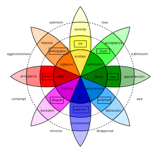
The eight fundamental emotions-joy, trust, fear, surprise, sadness, anticipation, anger, and disgust are using in this research.
5.1. Questionnaire
This study selects a 5-point Likert scale to collect emotional responses towards garments by visually impaired individuals and due to its suitability for small sample sizes, it allows for a balanced range of opinions because it is a one-to-one interaction, making it ideal for studies involving just 10 participants. Likert scales are commonly used in user experience and emotional design studies to find subjective feedback in a quantifiable form (Joshi et al., 2015). Moreover, previous studies have shown that visually impaired individuals can effectively respond to Likert-type questions when the content is communicated verbally or through assistive methods (Alali, 2017).
The fabrics, cotton, linen, viscose, and polyester are chosen for their tactile diversity and prevalence in daily wear, as earlier research has shown that fabric textures significantly influence emotional responses and user preferences in clothing (Moody, Kinderman, & Sinha, 2010; Jang & Ha, 2021). It is relevant for visually impaired individuals, for whom feedback of tactile plays an essential role in garment interaction (Lima Júnior & Zuanon, 2016). The colours-white, black, green, yellow, blue, and beige-are selected for their associations with emotional and psychological states. White and black represent emotional contrasts, with white often connected to calmness and clarity and black associated with depth or discomfort depending on cultural context (Kaya & Epps, 2004). Green and yellow are warm; green gives freshness and balance, while yellow provides joy or alertness (Ou et al., 2004). Blue shows trust or admiration, and beige, an earthy tone, supports more balanced emotional responses (Saito, 1996). These colour selections coincide with research showing that even visually impaired individuals can connect emotional colour associations through memory, cultural aspects, and linguistic references (Kim et al., 2021).
The author of this study uses a questionnaire to collect data on respondents' feelings about various clothing textiles. In this study, the author used a 5-point Likert scale (Strongly disagree, Disagree, Neutral, Agree, strongly agree) for the questionnaire after analysing the eight primary emotions in Plutchik's wheel.
Selection of the garments (Same fabric quality but different colour, Table 1):
100% Viscose T-shirt in white and black
100% polyester garment in beige and green
100% cotton T-shirt in yellow and blue
100% Linen casual wear shirt in white and black
Table 1 List of Daily Wear Garments (Same Fabric in Different Colours)
| S.no | Fabric name with garment | Synthetic/Natural/ Regenerated | Colour of the fabric |
|---|---|---|---|
| 1 | 100% Viscose T shirt | Regenerated | White |
| 2 | 100% Viscose T shirt | Regenerated | Black |
| 3 | 100% Polyester, T shirt | Synthetic | Beige |
| 4 | 100% Polyester, T shirt | Synthetic | Green |
| 5 | 100% cotton T shirt | Natural | Yellow |
| 6 | 100% cotton T shirt | Natural | Blue |
| 7 | 100% Linen casual wear shirt | Natural | Black |
| 8 | 100% Linen casual wear shirt | Natural | White |
6. Data Collection
This paper includes 8 questionnaires on a 5-point Likert scale that included a list of the eight emotions that Plutchik had identified. Ten visually impaired individuals are selected for the research. All participants are in good health, are between the ages of 18 and 22, are from Jaipur, India, have Indian nationality, and could speak both Hindi and English. The goal of choosing solely Indian residents as participants is to lessen the possibility of cultural disparities. The selection of garments is based on what people normally wear in their daily lives. Before handling any samples, participants were instructed to wipe their hands with wet tissues and then they sit on the right place. They were not allowed to apply any moisturizing lotion to their hands later which would affect how they perceived the sensation. Each interaction with a garment by a participant lasted for 30 seconds, which is regarded as one trial. There were brief intermissions between each trial so that the little gap in between the two questionnaires about the emotional implications of feeling the materials could be answered. As a combination of valence and arousal states, the engagement-boredom question tries to determine how much participants are interested in the task. The data collection took place in Netra Sansthan Jaipur, India. It was informed that the purpose of this study was to document the participants' emotional reactions to the handling of various clothing made of various sorts of textiles. The method was described to the participants, and it was made clear that they might leave at any time if they were uncomfortable.
7. Analysis and Results
The author calculated the mean of each fabric in terms of each emotion after collecting data on 8 outfits using a 5-point Likert scale. The individual mean of each emotion toward the chosen fabrics is shown via the average. And based on this author calculated cumulative intervals (Table 2). Calculate the total number of responses for each emotion level for each of the fabric questionnaire (Strongly Disagree, Disagree, Neutral, Agree, Strongly Agree). Fig. 2, 3, 4, 5 are showing the comparison of emotional responses on different colours garments (Mean Scores).
Table 2 Confidence intervals
| Garments | 100% Viscose T shirt, White | 100% Viscose T shirt, Black | 100% Polyester, T shirt, Beige | 100% Polyester, T shirt, Green | 100% cotton T shirt, yellow | 100% cotton T shirt, Blue | 100% Linen casual wear shirt, Black | 100% Linen casual wear shirt, white |
| Confidence Intervals | Ecstasy :95.0 confidence interval 3.4 and 5.0 | Ecstasy:95.0 confidence interval 2.8 and 4.8 | Amazement:95.0 confidence interval 1.6 and 3.8 | Ecstasy :95.0 confidence interval 2.0 and 4.2 | Ecstasy: 95.0 confidence interval 2.1 and 4.4 | Admiration: 95.0 confidence interval 3.9 and 4.8 | Loathing: 95.0 confidence interval 2.4 and 4.5 | Loathing: 95.0 confidence interval 2.1 and 4.5 |
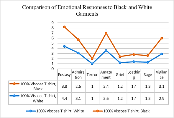
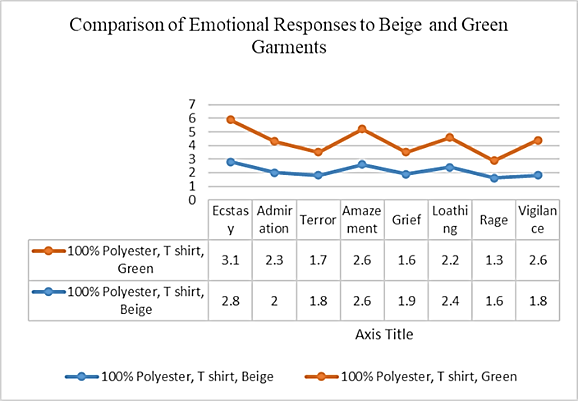
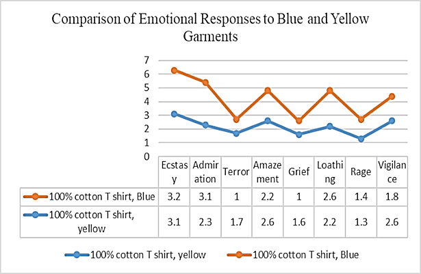
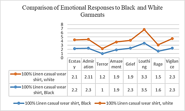
From the analysis shown in Table 2 and Figs 2-5 that white and black colour viscose t-shirts both provides ecstasy's response, suggesting that viscose's soft, smooth, and drapey tactile quality had a more substantial emotional impact than colour variation. This is especially relevant in visually impaired individuals, where touch becomes the primary sensory input for clothing evaluation. The continuous positive response across colour variants supports that some tactile properties can relatively arise positive emotions, aligning with Plutchik’s emotional model (Jang & Ha, 2021; Plutchik, 2001).
The beige provides amazement and green provides ecstasy in the 100% polyester garment. Although the fabric remained the same, the emotional response varied, highlights that the influence of colour can shape the emotional perception. This contrast shows in studies on colour-emotion associations (Ou et al., 2004).
In the 100% cotton t-shirt, yellow triggered ecstasy while blue elicited admiration, emphasizing how colour alone can differentiate emotional experiences when fabric texture is constant. Yellow is generally linked to energy and optimism, and blue is associated with trust and calmness (Kaya & Epps, 2004).
For the 100% linen casual shirt, both the white and black variants give loathing, indicating that fabric texture played a dominant role in emotional response aspects. Linen fabric is rough by nature, Jang and Ha’s (2021) findings that rough or textures often produce negative feeling while colour played a minor role, shades like black and white may also contribute to emotional distance in specific contexts (Ou et al., 2004). Together, these results underscore the importance of tactile quality over visual elements for visually impaired individuals and validate the application of Plutchik’s Wheel for mapping such sensory-based emotional reactions.
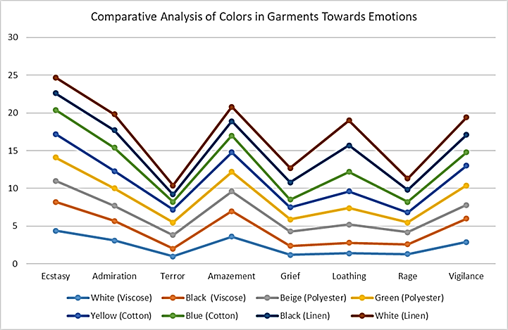
Fig. 6 shows significant contrasts towards different emotional states. For example, while both white linen and white viscose share the same colour, they provide opposite responses-white linen gives loathing, whereas white viscose was associated with ecstasy. This difference highlights the influence of fabric texture over colour in emotional response in visually impaired individuals, who are more dependent on tactile feedback due to the absence of sight. These findings address the study’s objectives: first, to explore whether emotional reactions to textiles can be detected through touch in visually impaired participants, and second, to identify how specific fabric-colour combinations shape those emotional responses. Studies show that tactile perception becomes the primary sense through which emotions are interpreted towards different colours.
Additionally, the emotional contrast seen in black linen versus black viscose further validates that colour alone is insufficient to evoke emotion; the interaction of texture and sensory familiarity triggers emotional meaning. Focuses on multisensory perception and how visually impaired individuals can experience and interpret the world through touch, sound, and language (Lewis, D., & Holloway, L., 2006).
8. Conclusion
The findings of this study open a new direction fin exploring emotional experiences towards different colour clothing, specifically for visually impaired individuals. By combining tactile perception and colour interaction with Plutchik’s emotional model, the research provides a structured way to understand emotions through non-visual garment experiences. This study focuses the combined emotional value of fabric and colour rather than as separate design elements. The approach can support the development of garments that are functionally inclusive and emotionally powerful. These insights give functional benefit to designers, educators, and retailers aiming to build sensory-rich experiences in garments and in other products. Future research may expand this foundation by integrating physiological emotion tracking and exploring different dimensions of inclusive sensory design.

