


 English (pdf)
 Article in xml format
 Article references
 Send this article by e-mail
 Cited by SciELO
  Similars in
SciELO
Similars in
SciELO 
 Permalink
1. Introduction
The concept of usability and user experience (UX), one of the most important issues in science and industry today, reveals the user's views on product and service interaction. One of the most important motivations of UX is to develop positive experiences rather than avoid bad ones due to usability considerations. In this way, the UX can meet the user's psychological needs and goals and influence subsequent product and service sales with necessary improvements. UX, which triggers the user's emotions and thus creates brand loyalty (Susilo, 2020), can experientially help different products and services in saturated markets (Saucken et al., 2013). When user experience is considered a design, it appears as a term that covers all kinds of activities that provide a better experience for the user in the next processes (Orlova, 2016). In the digitalizing world, the relationships carried out through traditional channels have also become digital, and the two-sided interaction factor has had to focus on humans and machines. This necessity has brought digitalization to the fore and ensured that the most crucial communication channels between the customer and the business are directly proportional to the websites. Thus, these communication channels, which provide less cost and convenience for both customers and businesses, have also changed all management and marketing policies, customer relations and processes of businesses.
Today, food businesses have to develop web-based marketing strategies. With this development, the necessity of measuring customers' user experiences in digital environments has arisen. Measuring user experiences in terms of marketing can be achieved by neuromarketing techniques. The starting point of this study was formed for this purpose. The main objective of this research is to measure the effects of the visual content dimensions of the user experiences on the websites of food businesses regarding the fixation numbers of attention, high concentration, anxiety and interest areas.
2. Literature review
According to Başaran (2014), in the process of establishing websites, it is necessary to understand the minds of users correctly and adopt an appropriate service approach and design the website in accordance with these parameters. Dimensions of user experience on websites are visual content (design), interaction, usability, users and content management (Bağan, 2020; Susilo, 2020). In recent years, one of the important features of user experience is visual content. The main reason for this is visuality has become the most interesting and intriguing element of marketing.
Given the studies on visual content in the literature, Bonnardel et al. (2011) emphasize that the choice of color on websites may affect the emotions of users. In the research byCoşkun and Yücel (2021), in which they measured EEG on websites, they emphasized that the reference point, colors and the feeling of missing an opportunity on websites were important for consumers. Sik-Lanyi (2012) drew attention to the use of white space on a website to make users felt more comfortable and pure. Ivory and Hearst (2002) mentioned the importance of using color to highlight the body and display of the text and using multiple colors and visuals for text links on the website.
According to Alican (2014), visual objects and texts not positioned with the right infrastructure and fonts that are not used correctly cause major problems regarding usability in perception and user experience. Fırlar and Özdem (2013) drew attention to the importance of using images in the background on websites, while Coleman (2010) revealed that the use of framing in visual content is important in terms of discovering visual effects. Drumeva (2013) drew attention to the importance of typography in a website. Cyr et al. (2009) stated that using human images in visual content planning on websites improves the user's perspective. According to Eschbach (1999) and Mohamed and Yousif (2010), the resolution is one of the most important factors controlling image quality and usability on a website.
Visual content, one of the most important dimensions of user experience on a website, is related to the entire website. The effects of integrity on the experiential design and the creation of other dimensions can increase website user experience performance. In this study, the relevant literature was reviewed, and the list of items related to visual content was created under four main headings (see Table 1):
Table 1 Visual Content Items
| Colour | Page Structure | Typography | Visual Objects |
| Simplicity (using white areas) Using the same colour shapes and textures Use of yellow-white, blue-green, and red-black colour combinations Using warm and cool colours | Negative space usage Using a lean structure Using cross-content order of importance Use of related items Using the main message of the page Message (#tag) image URL image Reservation infographic Online reservation image Feedback form image Promotional image Online payment image FAQ image Space | Using different points Header image Animated elements image | Picture Video Photograph Background image Framing Resolution Functional Photos |
According to Nielsen (2006), users do not focus on elements with a design similar to an advertisement given with visual objects on a website, even if it is not for promotional purposes. According to Abuín (2008), if an advertisement image is integrated into the website content, users cannot identify it quickly because they think it contains irrelevant information. Therefore, the use of advertisements in visual objects can be perceived as "complex" by users. Orlova (2016), in a study about user experience design in developing a website, focused on the processes of redesigning websites by considering user experiences. This study discusses the importance of the human factor in user experience; usability, colours used, and design factors are emphasized. According to Monetate (2018), more than one billion restaurant visits by consumers are made through digital marketing channels. It has been concluded that 40% of customers visit restaurants' websites and blogs before visiting a restaurant.
One of the most basic features of the brain, it takes advantage of similar relationships between objects in the environment to reveal visual perception and cognition (Bar, 2004). Neuroimaging devices are needed to test these two contextual relationships. According to a finding from one study, it was revealed that users often read web pages in an F-shaped pattern in eye tracking, and this pattern is expressed as two horizontal stripes, then vertical stripes. Nielsen (2006) examined eye movements in web content in a study conducted. Two hundred thirty-two participants participated in the research, and the content of more than a thousand web pages was shown. According to the findings of this research, most participants drew an F pattern with eye movements (Nielsen, 2006).
Coşkun (2019) examined electronic commerce websites with EEG and eye-tracking devices in terms of neuromarketing. It is concluded that writing the product price of a brand in red and large fonts attracts users' attention more, and the woman in another coat brand promotion is not remarkable and does not pay attention to the users. In addition, eye-tracking data concluded that the expression "discount" attracts the users' attention.
Although there are user experience studies on e-commerce sites in the literature, these studies are generally theoretical and limited. Thus, this study's impact and prevalence value, which measures the user experience on websites with neuromarketing techniques and applies it to food businesses, will be valuable. Because a food business will measure users' experiences on its website with a neuroscientific approach and the result was sought: "how should the visual content of a food business website be?, this study aims to reach the answer to the question with neuroscientific evidence may be one of the important contributions of our study to the relevant literature.
3. Methodology
A mixed research method was used in this study, which aims to measure with the Delphi method, one of the qualitative research methods, which was first applied to determine the user experience on the websites of food businesses. With the data obtained from this method, it is planned to create an item pool for the website's content that will be created later. It has been finalized using the items in the created pool. The people who applied the Delphi method also consist of eight experts whose eye-tracking and EEG data will be tested in the experimental part of this research. Subjects are made up of experts in the field. With the items finalized according to the data obtained from the Delphi method, two websites were established, and these food business websites focused on visual content. The first of these websites was named experiment1 (D1), and the second one was named experiment2 (D2). After this process, the first part of this research was completed. The created food business websites were shown to eight people one by one in an experimental process, eye-tracking and EEG from neuromarketing measurement techniques were used to measure user experiences. For each of these techniques, devices were approved by the Anadolu University Ethics Committee. The devices used in this study were suitable and did not cause any ethical problems, had no inputs and outputs, and had no harm regarding health.
The frequency bands used in the analysis of EEG data are as follows (Ekmekçi, 2019; Tosun et al., 2018) (Table 2):
Table 2 Frequency Bands Used in EEG Data Analysis
| Waves | Symbol | Frequency Range (Hz) | Explanation |
| Alpha | α | 8 ~ 13 | It is seen when individuals are attentive and close their eyes to rest and quality learning situations. It signifies alert, but also relaxed states. |
| Beta-1 | β | 13 ~ 20 | It is seen in a state of concentration, when the nervous systems of individuals are in an active state (usually in thinking states). |
| Beta-2 | β | 20 ~ 30 | In individuals, there are situations where high concentration goes into a state of anxiety. |
In this study, Alpha, Beta-1, and Beta-2 brain waves were taken as reference, and after the EEG data obtained from experts, attention, high concentration, anxiety and stress factors were considered. Customer ratings in Eskişehir from Tripadvisor and Foursquare were compared and averaged, and the top eight restaurants with the highest score are listed. The scores obtained were realized as of February 2020. The ranking codes of the restaurants were determined according to the customer scores obtained from two websites. Ethically, the names of the restaurants were not given. A code was assigned to each restaurant and the expert representing the restaurant. Eight experts were the people who set up and manage the websites of those businesses. Experts were also people who were previously involved in the Delphi method. The codes of restaurants were R1, R2, R3……, R8, and experts were represented as K1, K2, K3,.., and K8.
3.1 Delphi Method
Delphi process was started with the first round on May 22, 2020. For the first round of Delphi method, the participants were contacted via e-mail. In the first round, brainstorming was done. In the second round, 28 sub-items on Table 1 was applied with a seven-point Likert-type questionnaire. The median (M), first quartile (Q1), third quartile (Q3) and interquartile range (G) values of the data obtained in the second round were calculated with SPSS Statistics 23 statistical program. The answers of the experts were determined according to the colour items, and according to these answers, the first quarter (Q1), third quarter (Q3), median and interquartile range (G) values were revealed. Şahin (2001), and Yurt and Kadıoğlu (2019) indicate that when the interquartile width is calculated with the "Q3-Q1" formula, items with less than “1.2” are considered as agreed items.
At the end of the fourth round, all 28 visual content items in Table 1 were accepted by the experts. After this stage, websites were created with these 28 items. The purpose of Delphi is to present the items for the opinion of experts after they have been removed from the literature.
3.2 Creation of Websites
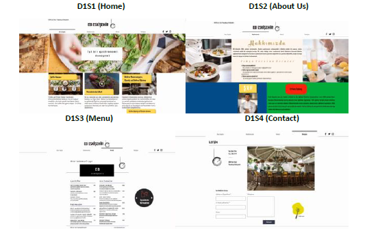
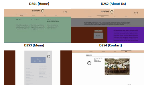
Two websites to be used in the research were established on “wix.com.” The first of these websites is called “experiment1” (D1) and has four tabs (Home, About Us, Menu, Contact) according to the data obtained from the experts who applied the Delphi technique (Figure 1). The second website, called “experiment2” (D2) also has four tabs (Figure 2). All visual content used in D1 was applied over 28 items extracted from the literature. The visual content used in D2 was chosen randomly and unplanned.
3.3 Experiment Procedure
Regarding the reliability of the test procedure, a standard website was first created, and the general contents that should be on this website were written in articles. The created standard website was not tested on the subjects. After the standard website was created and the borders were determined, two websites were created, which were called experiment1 (D1) and experiment2 (D2). In the first one, eight people consisting of experts were tested independently from each other, and the website called "experiment1", which was created according to 28 sub-items obtained from the Delphi method, was shown. During the display of this website, data were collected simultaneously using the devices mentioned above (EEG and Eyetracking). The created website consisted of four tabs (Home Page, About Us, Menu Page, Contact Page). According to these four tabs, the total fixation numbers of the participants in the areas of attention, high concentration, anxiety and interest were tested on two websites. Another website created was named “experiment2.” On this website, some manipulations were made against experiment1. While there were items created due to the related literature and Delphi method in experiment1, these items were not applied in experiment2.
The content that should be on a website was studied by analyzing the content of the four most preferred food and beverage business websites worldwide between June 6, 2020 - August 30, 2020. Two of these websites offer fast food services, while the other two provide premium restaurant services. The average length of stay of the guests on these four websites was calculated. At the same time, the total number of words on these four websites was also calculated. According to this study, the average word count of the four websites was calculated as 4910 words. The average duration of visitor stay was 7 min. 44 sec. The number of words a person can perceive in a minute is 600, and the number of words a person can perceive in a second is 10 (Ekmekçi, 2019). Therefore, the average number of words and the average duration of visitor stay of these four websites for which content analysis was performed are compatible with the number of words perceived in a minute. For the experiment1 and experiment2 websites prepared for the experiment, the number of words for each was 551 and corresponded to 55 seconds. In the light of all these statements, since the display of the websites was considered a whole, the appropriate display time was 55 seconds for each website.
The suitable hours for the experiment, which took place on October 11, 2020, in the Psychomotor Laboratory of the Faculty of Sport Sciences of Eskişehir Technical University, were determined as 9:00 am - 11:00 am in the morning. The most important reason is that a person experiences the most productive hours of brain activity within a few hours after starting the day in the morning with a rested body during the day, according to his biological clock. Because waking up with daylight while waking up from sleep positively affects that person's mental performance during the day (Güleç et al., 2018). Thus, eight experts in the present study were told to sleep at 11:00 pm and wake up at 7:00 am the day before the experiment.
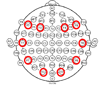
On the day of the experiment, the subjects were called individually and independently with the participant code (e.g., K1 and K2) given to each subject, and the EEG device was first connected. Immediately after the EEG device was connected, the eye tracking device was connected and calibrated. Electrodes placed on the device in EEG are as follows (Table 3):
Table 3 Electrodes and Functions
| Electrodes | Functions |
| F3 ve F4 | Visual attention level, providing control of eye movements. |
| F7 ve F8 | Calculation on the mind, individual reactions in decision making. |
| T7 ve T8 | Placement of images, face recognition process, the interaction of visual elements in perception, visual monitoring of movement, selective processing of text and speech. |
| P7 ve P8 | Face recognition process, focusing on visual movements, visual fixation process, structural evaluation of familiar objects, continuous attention to shapes and colours, and face-name cooperation. |
| O1 ve O2 | Identifying shapes, distinguishing colours, visual attention process, perception of shapes, recording visual information, and visual-oriented working memory. |
F3 and F4 were placed in the frontal region for measuring visual attention and control of eye movements. F7 and F8 were also placed in the frontal region for decision-making. T7 and T8 were placed in the temporal region for measuring visual placement, face recognition, the interaction of visual elements in perception, and visual tracking of movement. P7 and P8 were placed in the parietal region for facial recognition, visual movement, constant attention to shapes and colours, while O1 and O2 were located in the occipital region for measuring determining shapes, distinguishing colours, visual attention process, perception of shapes, recording visual information, visual-oriented working memory-oriented data (Gündüz, 2018) (Figure 3).
The paradigm and procedure of the experiment are shown in Table 4:
Table 4 Experiment Procedure
| Home | About Us | Menu | Contact | ||||||
| Website | D1 | D2 | D1 | D2 | D1 | D2 | D1 | D2 | |
| Sub-items | R1, R2, Y5, Y8, Y9, Y12, G2, G3, G4, G5, G7 | R3, R4, Y13, Y14, T1, T2, G1 | Y1, Y2, Y3, Y4, Y6, Y7, Y11 | Y10, T3, G6 | |||||
| Hypotheses | H1, H5, H9, H13 | H2, H6, H10, H14 | H3, H7, H11, H15 | H4, H8, H12, H16 | |||||
Sub-items determined by the Delphi method were applied to the tabs on the websites. Different sub-items were applied in each tab, and the differences between the tabs were determined by the EEG and eye-tracking data obtained at the end of the experiment (Alpha, Beta-1, Beta-2 frequencies and AOI for total fixation times) (Table 5).
Table 5 Sub-Articles Used on Websites
| Colour | Typography | |
| Simplicity (use of white areas) (R1) Using the same colour shapes and textures (R2) Use of yellow-white, blue-green, and red-black colour combinations (R3) Using warm and cool colours (R4) | Using different font sizes (T1) Header image (T2) Moving elements visual (T3) | |
| Page Structure | Visual Objects | |
| Negative space use (Y1) Using a lean structure (Y2) Using cross-content order of importance (Y3) Use of related items (Y4) Using the main message of the page (Y5) Message (#tag) image (Y6) | URL image (Y7) Reservation infographic (Y8) Online reservation image (Y9) Feedback form image (Y10) Promotional image (Y11) Online payment image (Y12) FAQ image (Y13) Space (Y14) | Picture (G1) Video (G2) Photo (G3) Background image (G4) Frame (G5) Resolution (G6) Functional Photos (G7) |
A transit system was set up during the experiment. The tabs in experiment1 and experiment2 (home page, about us, menu and contact) were showed 55 seconds in total. After it is displayed, it automatically switches to the next tab. Therefore, it was deemed appropriate to install this system to avoid loss of seconds and data based on infrastructure (e.g., internet and computer system problems). Figure 4 shows the experiment passing procedure.
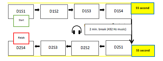
During the experiment, a 2-minute music playback (432 Hz) was performed immediately after displaying the experiment1 website (55 seconds later). After the music, the experiment2 website was shown. Crotti (2017) emphasizes that 432 Hz music is important for meditation, relaxation, mindfulness and spirituality. Therefore, the music playing during the transition from experiment1 to experiment2 was made for relaxing the working brain during experiment1. Thus, the measurement data taken from the experiment2 website were provided in a much more efficient structure.
With the EEG and eye-tracking data obtained from the experiment, experiment1 home page and experiment2 home page, experiment1 about us and experiment2 about us, experiment1 menu and experiment2 menu and experiment1 contact and experiment2 contact, which were applied differently to each page.
In this research, IBM SPSS Statistics v23 was used to test the EEG and eye-tracking data obtained from the experiment. According to the results of the Shapiro-Wilk test applied, the findings showed that the p-value was fewer than .05 (p=.00). Therefore, it was concluded that the distribution of the data to be used in this research was not normal, and non-parametric tests should be used.
In this research, there were two websites, each with four tabs (Home, About Us, Menu, Contact). The first of these websites was called experiment1 (D1), where 28 visual content sub-items applied to experts with the Delphi method were applied with visual content items unearthed from the literature. On the experiment1 website, 28 items were distributed between tabs, and each item was expressed in Table 4 above. On the experiment2 (D2) website, the visual content on the experiment1 website, where 28 sub-items are distributed on the tabs, was not applied and not located.
The subjects of the research are the managers of the websites of the eight most preferred restaurants in Eşkişehir. Each of the participants was given codes from K1 to K8. Homepage tab of experiment1 website D1S1, Homepage tab of experiment2 website D2S1, About Us tab of experiment1 website D1S2, About Us tab of experiment2 website D2S2, Menu tab of experiment1 website D1S3, Menu tab of experiment2 website D2S3, Contact tab of experiment1 website D1S4, and the Contact tab of the experiment2 website was named D2S4. In cases where a comparison was made over the subjects, the participant code was added in front of these codings (for example, K1D1S1 refers to the data of the first participant in the home page tab of the experiment1 website).
Wilcoxon Signed-Ranks test, one of the non-parametric tests, was used to test the hypotheses to be used in the research. The Wilcoxon Signed-Rank test is the non-parametric equivalent of the Dependent Samples t-test. It is a test that provides valid results in cases where it is not possible to use the Dependent Samples t-test (if the distribution of the data is not normal) (Büyüköztürk, 2012).
The following hypotheses are presented:
H1: There is a significant difference in the Alpha frequency level of the visual content in the Experiment1 and the Experiment2 home page tab.
H2: There is a significant difference in the Alpha frequency level of the visual content on the Experiment1 and Experiment2 about us tab.
H3: There is a significant difference in the Alpha frequency level of the visual content in the Experiment1 and the Experiment2 menu tab.
H4: There is a significant difference in the Alpha frequency level of the visual content in the Experiment1 and the Experiment2 contact tab.
H5: There is a significant difference in the Beta-1 frequency level of the visual content on the Experiment1 and the Experiment2 home page tab.
H6: There is a significant difference in the Beta-1 frequency level of the visual content in the Experiment1 and the Experiment2 about us tab.
H7: There is a significant difference in the Beta-1 frequency level of the visual content in the Experiment1 and the Experiment2 menu tab.
H8: There is a significant difference in the Beta-1 frequency level of the visual content in the Experiment1 and the Experiment2 contact tab.
H9: There is a significant difference in the Beta-2 frequency level of the visual content on the Experiment1 and the Experiment2 home page tab.
H10: There is a significant difference in the Beta-2 frequency level of the visual content on the Experiment1 and the Experiment2 about us tab.
H11: There is a significant difference in the Beta-2 frequency level of the visual content in the Experiment1 and the Experiment2 menu tab.
H12: There is a significant difference in the Beta-2 frequency level of the visual content in the Experiment1 and the Experiment2 contact tab.
H13: There is a significant difference between the total fixation number of the sum of interests of the visual contents in the experiment1 and the experiment2 home page tab.
H14: There is a significant difference between the total fixation number of the sum of interests of the visual content in the experiment1 and experiment2 about us tab.
H15: There is a significant difference between the total fixation number of the sum of interests of the visual contents in the Experiment1 and the Experiment2 menu tab.
H16: There is a significant difference between the total fixation number of the sum of interests of the visual contents in the Experiment1 and the Experiment2 contact tab.
4. Results
To identify the differences between the tabs on the websites, each tab was evaluated among itself.
4.1 Home Tab (S1) Results
Differences between home page tabs of D1 and D2 were compared with attention in the Alpha frequency range, high concentration in the Beta-1 frequency range, and anxiety in the Beta-2 frequency range using EEG device. At the same time, it was compared with the total fixation numbers using the eye-tracking device. In the findings of these comparisons, it was revealed that the home page tab of D1 was more effective on attention, high concentration and fixation numbers. On the home page, it was seen that D2 was higher in anxiety levels. Therefore, in the light of all the data, the visual contents of the D1 home tab showed a more efficient tabulation over the sub-items applied compared to the D2 home tab regarding attention, high concentration, anxiety and total fixation numbers (Table 6).
Table 6 Wilcoxon Signed Ranks Test Results Between D1S1 and D2S1 for Alpha, Beta-1, Beta-2, AOI and Hypotheses
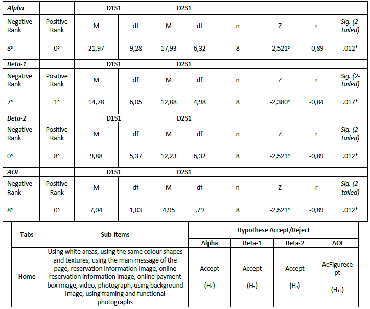
Figure 5 below shows the temperature maps of D1S1 and D2S1. In D2S1, the interest was converged at the midpoint of the page. In D1S1, on the other hand, it was seen that the interest spread to the whole page. The most important reason for this was that 11 sub-items were spread over every page area in D1S1. Therefore, from the two websites that proved to have significant differences in the H13 hypothesis. It was revealed that D1S1 had more fixation than D2S1 regarding total fixation numbers.
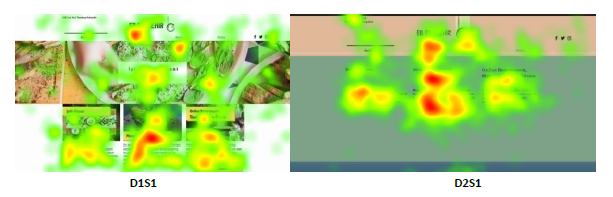
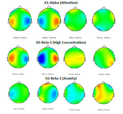
Figure 6 shows the effects of the difference of K1, which was tried to be confirmed in the H1 hypothesis. It was seen that the brain activities in the parietal and occipital regions in the home page tab of K1D1 on the left were more intense than in the K1D2 home page tab on the right. The effects of the difference of K5 tried to be confirmed in the H5 hypothesis. It was revealed that the brain activities in the parietal and temporal regions on the home page of K5D1 on the left are more intense than on the K5D2 home page on the right. Despite all this, the effects of the difference, which were tried to be confirmed in the H9 hypothesis, on K2, it was revealed that brain activities in the parietal, temporal and frontal regions in the home page tab of K2D1 on the left were less than in the K2D2 home page on the right.
4.2 About Us Tab (S2) Results
In the light of the findings obtained in this study (Table 7), it was revealed that D1's about us tab was more effective on attention, high concentration and fixation numbers. On the other hand, it was seen that D2 had a higher level of anxiety in the about us tab. Therefore, in the light of all the data, the visual contents of the D1 about us tab regarding attention, high concentration, anxiety and total fixation numbers, it was revealed that D2 was a more efficient tab over the sub-items applied compared to the about us tab.
Table 7 Wilcoxon Signed Ranks Test Results Between D1S2 and D2S2 for Alpha, Beta-1, Beta-2, AOI and Hypotheses
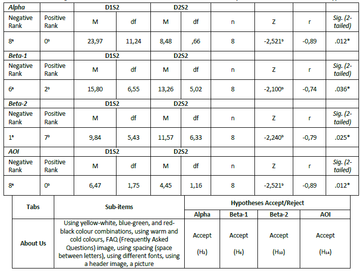
Figure 7 shows the temperature maps of D1S2 and D2S2. In D2S2, the interest was converged at the midpoint of the page. In D1S2, it was seen that the interest spread to the whole page. The most important reason for this was that seven sub-items were spread over every area of the page in D1S2. Therefore, from the two websites that proved to have significant differences in the H14 hypothesis, it was revealed that D1S2 had more fixation than D2S2 regarding total fixation numbers.
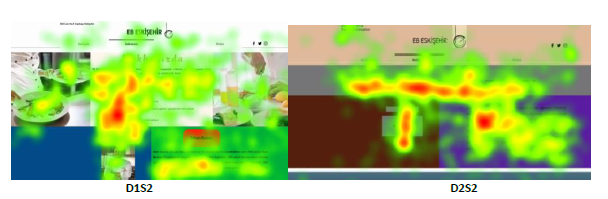
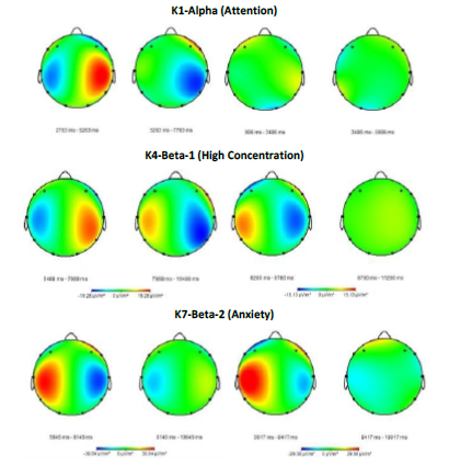
Figure 8 shows the effects of the difference, which was tried to be confirmed in the H2 hypothesis on K5. It was revealed that brain activities in the parietal and temporal regions in the about us tab of K5D1 on the left were more intense than in the K5D2 tab on the right.
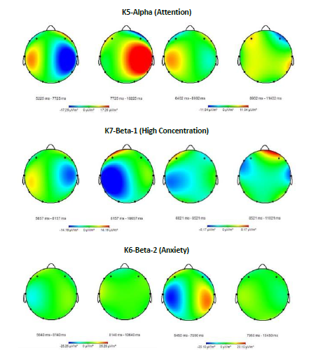
At the same time, the effects of the difference tried to be confirmed in the H6 hypothesis on K7, showing that brain activities in the parietal and temporal regions in the about us tab of K7D1 on the left side were more intense than in the K7D2 about us tab on the right. Also, the effects of the difference in Beta-2 frequency, which was tried to be confirmed in the H10 hypothesis on K6, showed that the brain activities in the parietal and temporal regions in the about us tab of K2D1 on the left side were less than the K2D2 about us tab on the right.
4.3 Menu Tab (S3) Results
In the findings of these comparisons, it was revealed that the menu tab of D1 was more effective on high concentration and fixation numbers, but there was no difference in attention. It was seen that D2 was higher in the anxiety level in the menu tab. Therefore, in light of all the data, the visual contents of the D1 menu tab showed that it was a more efficient tab over the sub-items applied compared to the D2 menu tab (Table 8).
Table 8 Wilcoxon Signed Ranks Test Results Between D1S3 and D2S3 for Alpha, Beta-1, Beta-2, AOI and Hypotheses
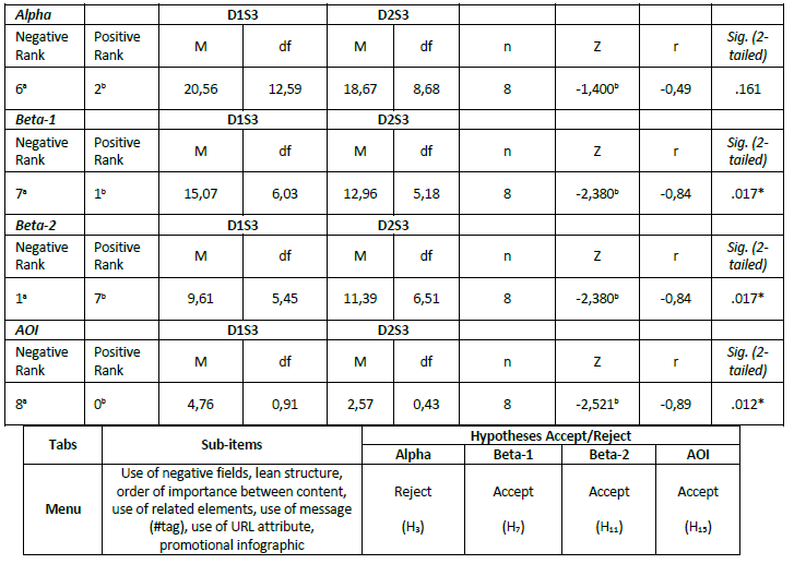
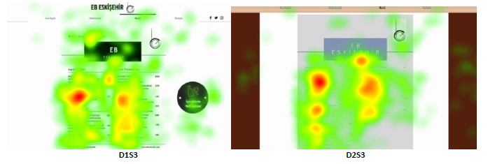
Figure 9 shows the heat maps of D1S3 and D2S3. In D2S3, the interest was converged at the midpoint of the page. In D1S3, on the other hand, it was seen that the interest spread to the whole page. The reason for this was that eight sub-items were spread over every area of the page in D1S3. Therefore, from the two websites that proved to have significant differences in the H15 hypothesis, it was revealed that D1S3 had more fixation than D2S3 regarding total fixation numbers (Figure 10).
4.4 Contact Tab (S4) Results
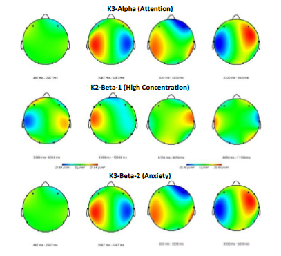
With the significant difference stated in the H4 hypothesis, it was revealed that the attention level in the Alpha frequency range of the D1 contact tab was more intense on all subjects than in the D2 contact tab. Additionally, it showed no difference in all subjects' Beta-1 and Beta-2 frequency levels. At the same time, a positive difference was found between D1S4 and D2S4 in terms of total fixation over D1 (Table 9).
Table 9 Wilcoxon Signed Ranks Test Results Between D1S4 and D2S4 for Alpha, Beta-1, Beta-2, AOI and Hypotheses
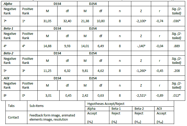
Figure 11 shows the temperature maps of D1S4 and D2S4. In D2S4, the interest was generally limited to pictures and addresses. In D1S4, on the other hand, it was seen that the interest spread to the whole page. This was because four sub-items are placed in certain areas of the page in D1S4. Therefore, from the two websites that proved to have significant differences in the H16 hypothesis, it was revealed that D1S4 had more fixation than D2S4 in terms of total fixation numbers. While the picture in D1 was 8192x4320 pixels regarding resolution, the same picture in D2 had a resolution of 470x246 pixels. It was seen that the fixation number of stays on the picture was higher in D1 than in D2. It showed that the interest in the middle of the picture in D2 was due to the low resolution of the picture and focusing only on one place reduced the interest in the whole picture.
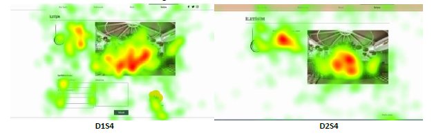
Figure 12 indicates the effects of the difference, which was tried to be confirmed in the H4 hypothesis on K1, showing that brain activities in the parietal and temporal regions in the contact tab of K1D1 on the left side were more intense than in the K1D2 contact tab on the right. In the cerebral activities of K4, it was revealed that the brain activities in the temporal and parietal regions in the contact tab of K4D1 on the left side did not differ compared to the K4D2 contact tab on the right. As seen on K7, the same situation was revealed in Beta-2.
5. Discussion
In a study conducted by Sik-Lanyi (2012) to reveal the effective colours used on websites, it is stated that the white areas used on websites make feel pure. The white areas used on the home page of the experiment1 website represent simplicity. The white colour, which is the sub-theme of the page, made the subjects feel comfortable with the attention, high concentration and anxiety levels that emerged in the Alpha, Beta-1, and Beta-2 frequencies. The interest in the white areas in the temperature map that appears on the experiment1 homepage is high. The focus was not only on a specific part but spread over the entire page frame, which provides an important result in terms of feeling the white areas. In experiment2 home page, white areas were not used, and the frame of the page was made with different and random colours. Looking the fixation number and hot map of this page, it shows a focus on the middle part of the page and only one part of the page, so the frame of the page is not efficient in terms of attention.
Bonnardel et al. (2011) reveal a relationship between colours and emotions, and a choice of colour may affect users' emotions and feedback. The theme of the sub-items applied on the experiment1 website on the page within a certain plan emphasizes that this relationship between colours and emotions regarding attention, high concentration and the total number of interest in experiment1 is effective in their feedback. The situation felt at the level of anxiety in experiment2, where no colour planning was done, is also associated with this conclusion.
Visual objects and texts that are not positioned with the right infrastructure on websites and fonts that are not used correctly cause major problems in terms of usability and user experience in perception (Alican, 2014: 86). Given the high interest in the main message image of the page used on the experiment1 website, it revealed the efficiency of the user experience in experiment1.
Fırlar and Özdem (2013) state that the use of images in the background in websites should be given in a functional way by providing an aesthetic structure. The functional food picture on the experiment1 home page tab, positioned just in the middle of the page, showed that plate visuals, one of the most important presentations of food businesses, increased the interest through the temperature map on the experiment1 home page.
Coleman (2010) revealed that the use of framing in visual content is significant in terms of discovering visual effects, it shapes the missing frames in people's minds, and this has a visual effect. Half of the plate image used in the experiment1 home page tab is displayed. However, the main purpose of framing is not to show the entire contents of the plate but to give an idea to the customer by showing a certain part of the plate. As shown by the data given by the subjects' temperature map over eye-tracking, the interest in the plate's image and the frame's end parts is high.
In a study conducted by Ivory and Hearst (2002) on experts and users, it was revealed that the use of colour for highlighting the body and display of text on the website, the use of multiple colours for text links, and the use of image links instead of text links are important. At the same time, Sik-Lanyi (2012), in his research to reveal the effective colours used on websites, found the brightness, warmth and attention of the yellow colour used on websites; the comfort of the blue colour; the freshness of the green colour; elegance and solemnity of black colour; it is stated that the colour red makes feel power, action and passion. The yellow-white, blue-green, and red-black colour combinations used in the experiment1 website and the header image in the middle of the page show the efficiency of the visual content planning of this tab.
According to Drumeva (2013), in a website design, typography should present the most important information and answer the most important questions without exposing the reader to unnecessary ornaments. The use of italics and bold letters enriches the website graphically. In this way, the boringness and monotony of large blocks of text are overcome, and an artistic rhythm can be added to the composition. This draws the user's attention and reduces visual stress. The space used in the experiment1 about us tab and the use of different fonts on an image reveal the importance of this tab regarding visual content success.
Karamustafa et al. (2002) concluded in their study that the Frequently Asked Questions (FAQ ) image should be used on websites, but the response rate by businesses through this feature is low. In this study, in line with the results reached, experiment1 about us tab is a much more efficient website tab than experiment2 regarding attention, high concentration, anxiety, and total fixation numbers, and the interest in this image is quite high, as can be seen in the temperature map in the FAQ image over eye-tracking data.
Cyr et al. (2009) conducted experimental research on the usability of human figures in website design, in which eye-tracking technology was also used. According to the results of related experiments, it is stated that human images encourage a user to perceive the website as more attractive, warm or socially present and more reliable. In this research, a picture of a chef is used in the about us tab of experiment1. Given the interest in the picture in D1 according to the heat map data, the focus on the chef's face, white coat and arms appear to be high.
Lee (2007) has concluded in his study that the effective use of negative space on websites is an important visual tool. The use of negative space in the D1 menu tab is given in black and white with the business name "EB Eskişehir." It is seen that the attention is on "Eskişehir," which represents the province to which the enterprise is affiliated, and not on "EB," which did not lead to a conclusion about the use of negative space.
In a study where Yang (2012) examined eye movements in the menus of food and beverage businesses, it is stated that the place that the eyes find attractive is the upper right corner of the menu. In this context, managers should pay attention to the menu contents. Contrary to the D2 menu tab, in D1, the order of importance between the content and the use of related items are planned. When the eye movements in the D1 menu are examined, it is seen that the attention is focused on the whole content. The most important purpose of this is to use a well-planned menu image. Therefore, it has been concluded that the content of a menu image used on websites is important regarding high concentration and fixation.
Karamustafa et al. (2002) have highlighted in their study that it is important to use the URL feature and promotional information image on websites. In the D1 menu tab, it is seen that the stays are realized on the promotional image (15% discount on drinks) on the right side of the page, which shows the effectiveness of the promotional image used. It was observed that the fixation on the URL image at the bottom of the page was limited.
Kotler (2017) has emphasized that in today's marketing world, it is possible to express content as "new ads" and tags (#) as "new slogans." The tag #tarladansofraya in the menu tab of this research is positioned as a slogan that gives the perspective of naturalness, locality and freshness in the home tab of the D1 website. It is seen that the interest in this positioned image is quite high when the temperature map values are examined. Therefore, labels expressed as “new slogans” and one of the most important contents of Marketing 5.0 have led to an important conclusion regarding the message it will give customers on the menu image.
According to Mohamed and Yousif (2010) and Eschbach (1999), the resolution is one of the most important elements controlling image quality and usability on a website. This research used two identical photographs in the D1 and D2 contact tabs. While the picture in D1 is 8192x4320 pixels in resolution, the same picture in D2 has a resolution of 470x246 pixels. It is seen that the fixation number of stays on the picture is higher in D1 than in D2, and the interest in the middle of the picture in D2 is due to the low resolution of the picture and focusing only on one place reduces the interest in the whole picture.
When the results of the four tabs used in D1 and D2 are generally examined, a study by Nielsen (2006) in the related literature examined eye movements in web content, and the findings have shown that eye movements draw an F shape on a web page. In this study, however, no F-shaped eye movement findings were found, as the interests were generally spread over a certain part of the page. Therefore, evaluating Nielsen's (2006) F-shaped eye movements finding in a study that was not planned according to interests and that only measured eye movements on a web page may yield more consistent results.
6. Conclusions
In accordance with the main purpose of this research, the effects of visual content dimensions of user experiences on the websites of food businesses on the number of fixation of attention, high concentration, anxiety and interest areas have been measured. One of the most basic results reached in this study is the effects of visual content items on user experience determined in the literature regarding attention, high concentration, anxiety and fixation. It has been determined that the experiment1 website is a much more successful and effective website than the experiment2 website, based on these parameters. It is inevitable that the visual content planning to be made on a website may increase the experience performance of the users on that website. This can have a positive effect on purchasing behaviour. Because of the more positive experiences of the users, different effects on the purchasing behaviour when it comes to the preference stage. The success of visually-oriented channels, such as websites, is very important for the future of digitalization. The planning of websites by focusing on experience forms the infrastructure of virtual communication to be established with customers in the future. Directing customers according to their wants and needs should be one of the most basic marketing goals of the future.
The most important results obtained in this study it has been determined that a website with visual content planning makes a significant difference regarding attention, high concentration and total interest numbers. It can make customers focus more on the content, while websites without visual content planning make a noticeable difference in the level of anxiety.
6.1 Theoretical Implications
This study provides an original contribution to neuromarketing research. The reason for this is that, to our knowledge, it has a working feature that has not been applied to these metrics before.
6.2 Practical Implications
This research assists in the visual content planning of websites used in the food and beverage industry. Substances applied on the Experiment1 website, which increase attention, high concentration, and the tendency toward areas of interest due to the experiment can increase the visual content success of food business websites.
6.3 Limitations
This study was applied to eight subjects in total. Different metrics can be measured by increasing the number of subjects. The websites used in this study were created based on the items that emerged from the relevant literature review. One of the main purposes here is to determine the suitability of substances regarding user experience. Therefore, the aim of "a website that is planned correctly in terms of visual content and that will lead to success can be as follows" constitutes the basis of this research. Different results can be achieved using different websites or existing businesses of food businesses.
6.4 Suggestions for Future Research
It is possible to list the suggestions of the research as follows:
The results of the research can be expanded by increasing the interest of the websites,
This research, which was applied to experts, can be extended and applied to customers.
Researchers who do research in the neuroscience field can obtain different and interesting results by turning to neuroscience-oriented studies when they consider the future impact of the food and beverage industry,
Different metrics can be measured by using different neuromarketing tools on websites,
The tabs used on the websites can be arranged according to their interests, and the differences between the tabs can be measured.
More specific results can be achieved by classifying businesses according to their types.

