


 English (pdf)
 Article in xml format
 Article references
 Send this article by e-mail
 Cited by SciELO
  Similars in
SciELO
Similars in
SciELO 
 Permalink
1. Introduction
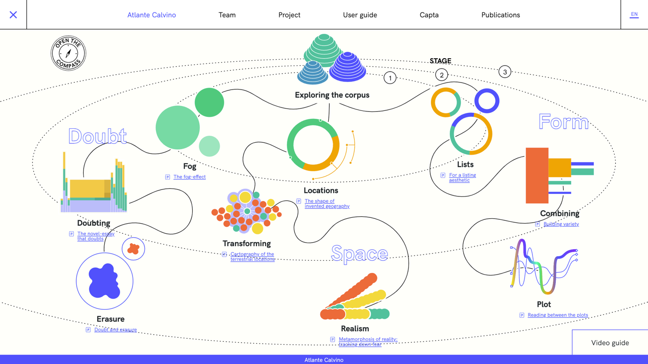
The research presented in this article focuses on the design of data visualizations for literary criticism and is conducted in the area known as Digital Humanities (DH). It took place in the context of the project Atlante Calvino, created around the narrative corpus of Italo Calvino, one of the most famous Italian writers of the XX Century. The project aimed to produce a series of data visualizations that display the author’s corpus of literary works and three analyses of literary criticism [note 1]. The team working on the project was composed of researchers from two disciplinary areas: critics of modern and contemporary Italian literature and information design researchers. Critics directed the project and asked designers to produce data visualizations in support of their inquiries (Fig. 1).
2. Problem setting
Data visualizations are representations of datasets that “communicate precise information and values” (Kennedy et al., 2016) [1] generally mapping discrete data into graphical primitives (Manovich, 2011) [2]. According to many, the goal of a visualization is to support the understanding of data with clear and transparent displays, to orient the reader’s attention to “the sense and substance of the data” (Tufte, 1999) [3], and to make “perceptible what would otherwise be imperceptible to the human sensorium” (Hinrichs et al., 2018) [4]. What is often overlooked is that visualization is a “transformative process” steered by visualization creators that emphasize specific characteristics of the source material while disregarding others (Rendgen et al., 2019) [5]. There is, therefore, no “view from nowhere,” even if visualizations are typically designed to conceal personal viewpoints and appear objective, transparent, scientific, and factual (Kennedy et al., 2016) [1]. The minimization of point of view may be a misguided practice (Viégas & Wattenberg, 2007) [6], especially in relation to humanistic disciplines that, instead, promote situated and interpretive standpoints.
Literary criticism is a field of study that promotes the analysis and interpretation of literary works, which are intended as aesthetic constructs that embed various levels of meaning and achieve a “certain effect” through the distribution of words and images (Rommel, 2004) [7]. Critics can be described as readers who write about something written by someone else, leveraging their literary culture [Note 2]. Their core methodology includes the “close reading” of literary works (i.e., the “detailed and precise attention to rhetoric, style, language choice” to inquire about “ideological formations that are subtextual”), the selection of samples, and the production of essays that discuss them (Hayles, 2010) [8]. If research conducted with data visualization is commonly supported by technical analysis, statistics, and reproducible results, literary criticism “is not written to be reproduced but to be followed, understood and questioned” as other forms of humanities work (Bradley et al., 2018) [9].
Data visualization and literary criticism have met since at least the early 2000s, opening an interdisciplinary area that includes humanities, technical disciplines, and design. Visualization is a component of “distant reading,” a well-known practice that implies statistical operations to analyze literary works and opened fruitful research directions in literary studies. The practice was introduced to study large corpora of texts (e.g., the entire production of a country or an epoch) that prevent human reading (Moretti, 2005) [10]. To bypass limitations deriving from quantity, researchers created computational tools for automatic data mining supported by visualizations that became the manifestation of the statistical models designed to study literature in this new fashion. Despite their data processing power, such computational tools can only work on texts’ “surface features” (e.g., counting words, detecting geographical entities, topic modeling) and cannot replace interpretive human capabilities. They only accept what can be defined unambiguously (McCarty, 2004) [11], even though ambiguity plays a central role in triggering the process of interpretation and sense-making that is so important to literary criticism and other humanistic disciplines. Critique of distant reading, therefore, warns about the risk of flattening ambiguities and limiting the understanding of literary works (Goodwin et al., 2011) [12]. By prioritizing the exigencies of technologies, computation brings the danger of hampering and jeopardizing humanities, which are too often seen as the testing ground for the demonstration of new digital tools for analyzing big datasets or corpora (Drucker, 2020) [13].
A design team member (from here on, the researcher) exploited this setting to inquire about the interaction between data visualizations and literary criticism. Although designers of the Atlante Calvino had expertise in visualizing humanistic data, literary criticism was a substantially new area, and they lacked guidance on how to deal with critic’s requests. The researcher exploited the setting of the project, in which critics fully participated in the work of visualization, to seek mitigation strategies for rendering data visualization compatible with qualitative and interpretive work. The goals underpinning the research were: (G1) to recognize and describe divergences between literary criticism and data visualization; (G2) to formulate guidelines to help visualization designers in their work and in relating with critics.
3. Methodology
Atlante Calvino required the investment of considerable work to create visualizations; therefore, the research methodology had to be tailored around its development. It was articulated as follows: [M1] combination of Action Research (AR) and Participant Observation (PO) to identify divergencies between criticism and data visualization; [M2] structured interviews and thematic analysis to understand critics’ experience of the design process. The combination of results from M1 and M2 brought to the formulation of design guidelines (see 4 Results).
3.1 Action Research and Participant Observation [M1]
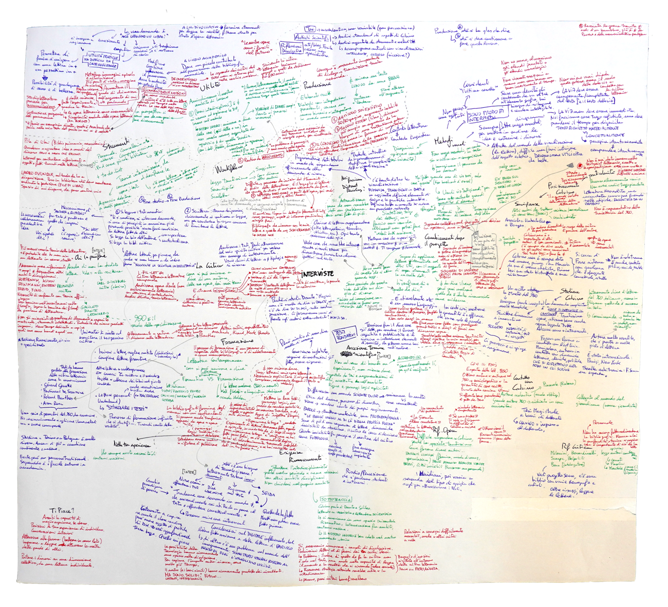
AR is a social sciences methodology adopted in design research due to its iterative nature that resembles the design process itself (Swann, 2002) [14]. AR can start with a general and vague idea of what needs to be improved or created, and it brings clarity on what to do next thanks to cycles of refinements (Fig. 2). PO is employed to understand the behaviors and interests of a community through the active involvement of a researcher in the researched context (Kawulich, 2005) [15]. AR drove the creation of visualizations and purposely involved critics; it followed the project development and was articulated in two phases. [P1] The making of guide visualizations [note 3] that describe Calvino’s production and are designed to assist scholars and students in gaining orientation. [P2] The making of visualizations articulated around three literary criticism “itineraries” [note 4]. The researcher conducted PO during the development of AR and documented observations in the form of field notes, email exchanges, sketches, photos, visualization drafts, datasets, and final artifacts. During the first phase of AR, the researcher documented critics’ reactions to the initial adoption of data visualization and, in the second phase, the process of articulation of literary inquiries into research workflows based on data visualization. (Fig. 3). The combination of AR and PO was employed in on-field settings to identify examples of divergences between data visualization and literary criticism. The following sections list the divergencies fundamental to formulating the guidelines outlined in section 4.
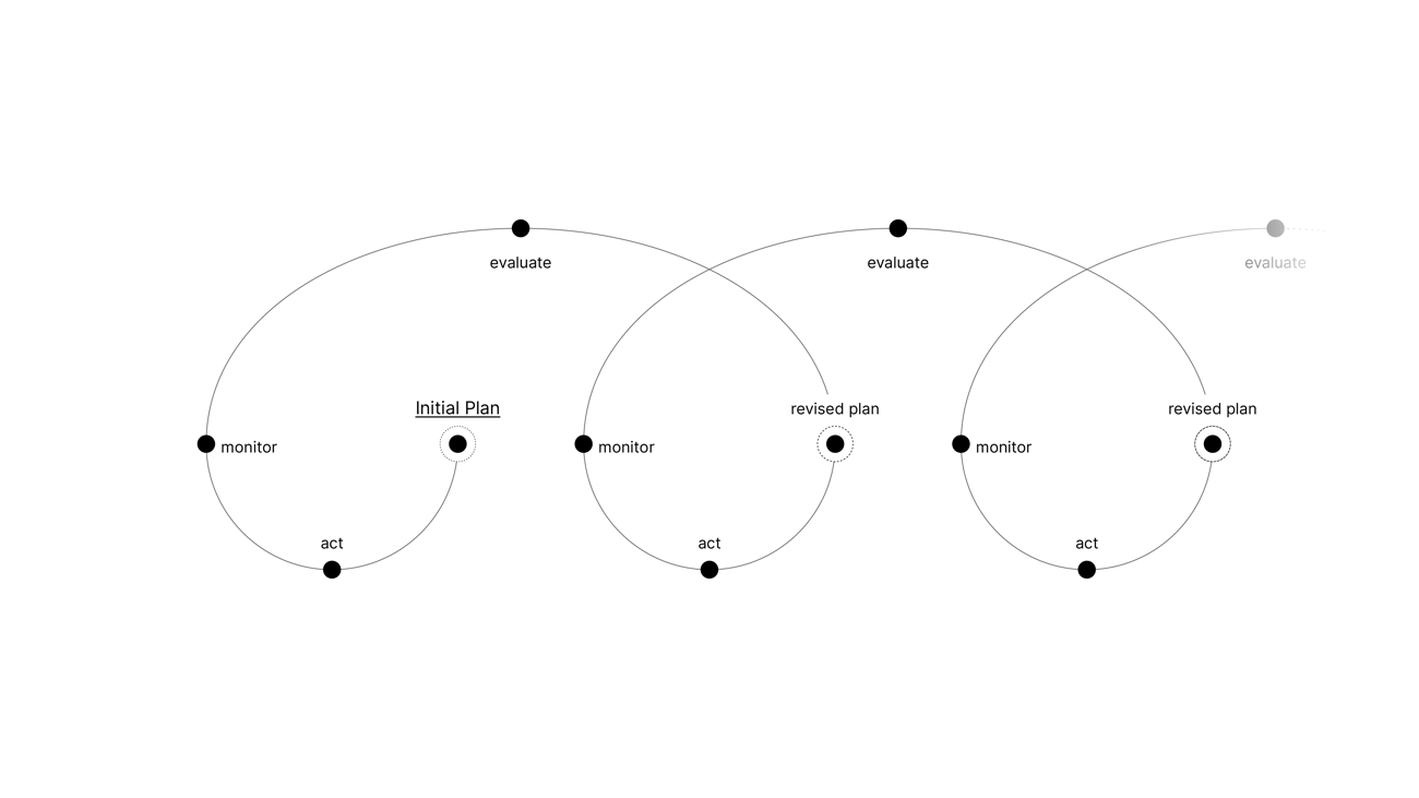
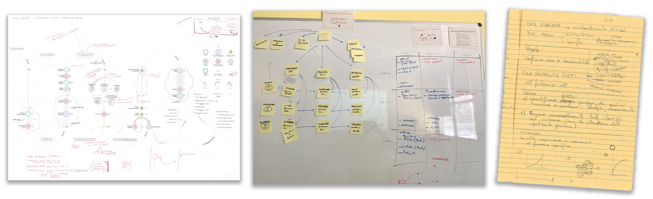
Figure 3 Examples of the materials collected during participant observation, from left to right: draft of a visualization, sketch on a whiteboard, field notes.
3.1.1 Interpretive data
In the context of literary criticism, data may present peculiar properties. In creating a dataset of Calvino’s literary works [P1], critics decided which texts to include rewritings, certain short stories, unfinished, failed works, and not released ones were deliberately omitted from the list and critics’ analysis. Consequently, the resulting dataset provides no complete vision of the entire production of Calvino but one that mirrors critics’ interests. The data harvested for analytical visualizations [P2] resulted from manual work conducted via close reading and text annotation. It depended on inquiries that investigated Calvino’s stylistic peculiarities and subtleties that are impossible to recognize with automatic tools (e.g., the universe compressed in a point used by Calvino as a setting location or a subtle doubt expression) [Note 5]. The use of no algorithmic solutions wards off the claim of factuality and objectivity that data commonly embodies, even if, as it is known, objectivity in data and visualization is only an imbued property (Drucker, 2020; Kennedy et al., 2016). The datasets of Atlante Calvino [note 6] stress two aspects. They do not tend to be complete and objective representations, and they look more like formatted lists of interpretations rather than lists of measurements.
3.1.2 Graphical shaping of visualizations
Critics requested to create visualizations that «spoke by themselves», apparently appealing to the colloquialism “a picture is worth a thousand words”. Designers took a while to realize that the request regarded the identification strategies to drive the reading of the visualizations with respect to critics’ interpretation, similarly to what is traditionally done in a written text (see also 3.1.3). AR led to the design of custom visualizations, namely that alter standard templates (e.g., bar chart, scatterplot, pie chart), introduce new ones, or use graphical aids (i.e., consistent usage of annotations and indexical signs). Examples include Archipelago of Names (Fig. 4), a network graph visualization that exploits graphical aids to compensate for the elision of labels but, at the same time, to convey scholars’ interpretation of the visualization, and Doubt and Erasure (Fig. 5), a visualization that imprints the scholar’s critical reading on the text of a story using a completely new visualization form [Note 7]. Standard visualizations successfully minimize creators’ points of view, but they reduce the agency of critics to convey their interpretations. Custom visualizations, instead, appeared capable of orienting readers and steering their attention at critics’ discretion.
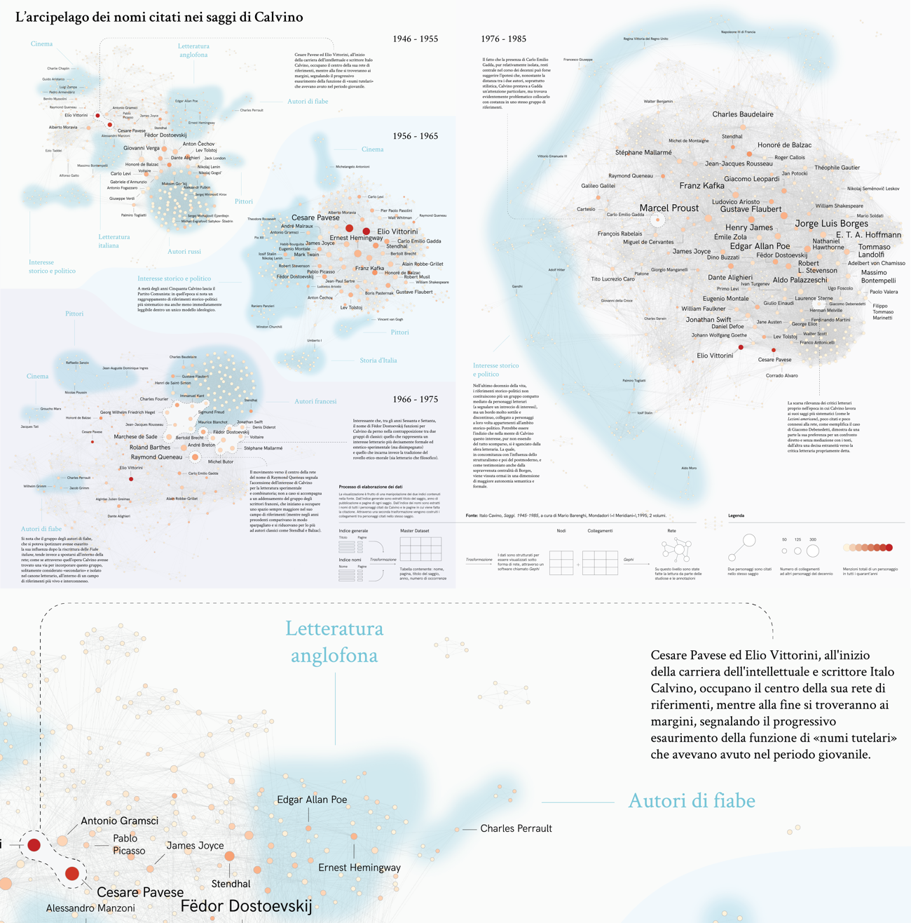
Figure 4 A) The visualization Archipelago of Names displays the mentions of other historical personalities in Calvino’s essays and during the four decades of his career. B) The zoom-in shows an example of graphical aids that support visualizations.
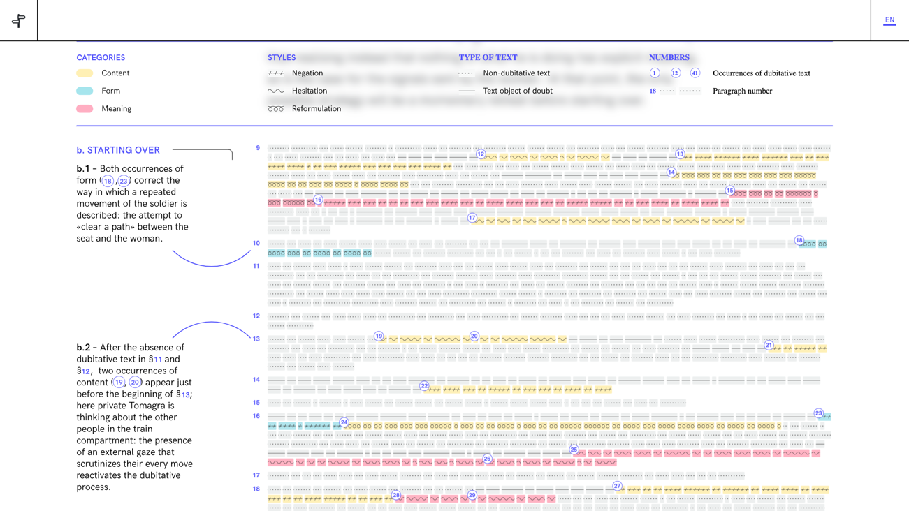
Figure 5 The figure shows Doubt and Erasure, which visualizes the interpretive reading of a critic. The visualization is a transfiguration of the text of a short story, in which characters are turned into symbols that represent narrative sequences.
3.1.3 Elusive concepts: the gap between language and data visualization
In the making of Time and Works (Fig. 6), critics asked to produce a visualization starting from a text document that verbally discusses the main turning points of Calvino’s career (including loosely described collaborations with newspapers) and lists his most relevant volumes. Designers found themselves working in a very unusual context, having no tool or method to translate discursive text into a visualization. Via AR, researchers created an artwork that blends traits of data visualization and a diagram, in which quantifiable information is represented with numerical or categorical encodings and qualitative information in the form of annotations and other graphical signs. In particular, the attempt to include genres in the visualization raised a conceptual problem since many literary works are generically described as hybrids between “collections of short stories” and “novels.” There was no specific categorization, and it was common for scholars to describe them in a roundabout way (i.e., with nuances and subtleties), while data visualization urges them to be selective and explicit. As they reported during work sessions, data is «black or white» while «nuances» and a full range of «shades» are needed to talk about literature. This problem may resonate with the work of visualization of uncertainty but is, in fact, substantially different because the representation of uncertainty eventually requires being explicit about the kind and amount of uncertainty to be displayed. Critics rely on a detailed and in-depth understanding of literary works and writers’ biographies that takes into consideration many subtextual or unmeasurable qualities that, nonetheless, play an essential role in the interpretive processes. We may call these qualities elusive concepts to stress the fact that any form of measurement or categorization may represent a limitation. The introduction of new definitions for literary works genres, which eventually translated into dedicated symbols, is the result of an influence exerted by data visualization on criticism.
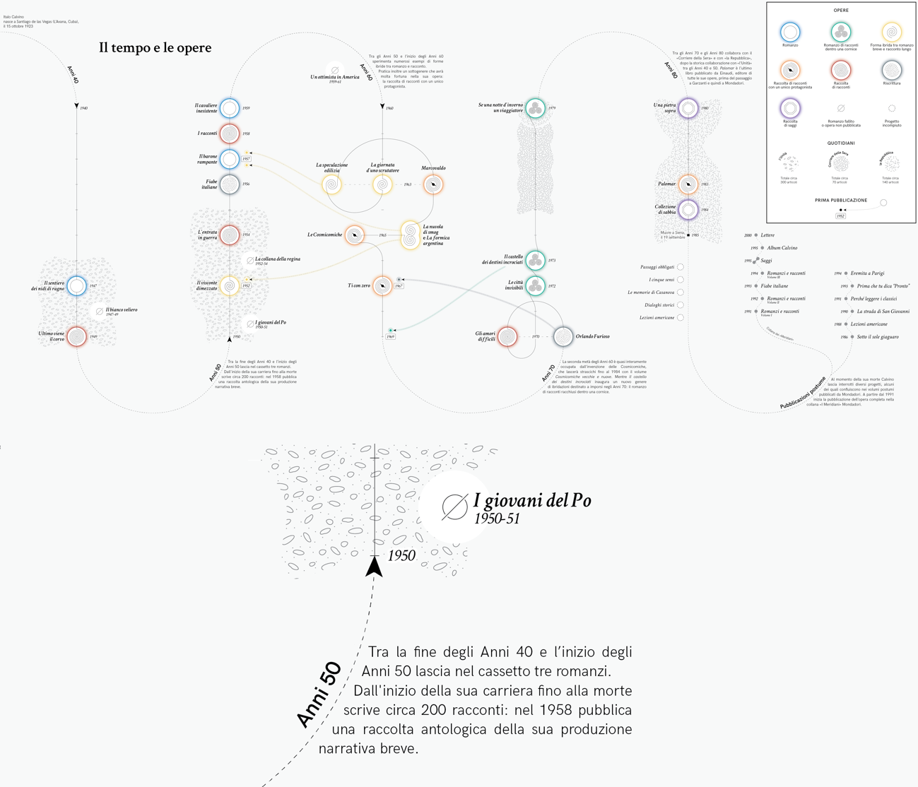
Figure 6 A) Time and Works. The sinusoidal shape of the visualization highlights decades. Genres are coded with custom symbols. B) Annotations convey critics’ views.
3.2 Structured interviews [M2]
Structured interviews (Seidman, 2006) [16] were used to unpack and understand Atlante Calvino from the perspective of the critics. Interviews were conducted as video calls, recorded, transcribed, and successively object to thematic analysis to identify recurring topics (Fig. 7). Questions were structured around different areas, including (A1) an overall description of the field of literary criticism and (A2) participants’ experience with visualization and their willingness to employ it in future works. Concerning A1, scholars described literary criticism as the analysis of a text written by another author with the goal of increasing its understanding and fostering the debate around it and literature in general. The work of critics is influenced by serendipity and personal expertise (i.e., «an individual journey through bibliography»), and, as other humanities disciplines, it values situatedness (Haraway, 1988) [17], interpretations, and accepts that one’s view may be contrasting with different stances. A critical divergence is that criticism would be empowered by individual cultures shaped over time and by the context in which they develop, and data would be characterized by the assumption of scientific objectivity.
Regarding A2, scholars reported to have partially used mind maps and diagrams to sort or communicate ideas concerning their literary studies. Still, they never did it in a systematic and structured way, such as done in Atlante Calvino. In their opinion, visualization is helpful, but its employment may be hampered by the intense work that it requires (i.e., formulating a research question that can be addressed through data, harvesting the data, and identifying the most suitable visual means to analyze them). As they state, visualization involves selection and loss of details, but it enables the presentation of a «big picture» and a new critical overview of the literary material that is otherwise inaccessible. The main advantage of visualization seems to be remediation, namely the possibility of observing contents in a different form and context. A more extended report is available in (Elli, 2022) [18].
4. Results
Considering the described divergencies, four guidelines are proposed to help information designers who work with literary critics to bridge the disciplinary gap and choose appropriate approaches and methods. In a design setting, guidelines are meant to orientate practitioners or researchers but, at the same time, should be interpreted in relation to the situation, leveraging sense-making and valorizing ambiguity (Gaver, 2012) [19].
4.1 Embed Situatedness
Criticism embraces personal expertise, individual standpoints, and the formulation of interpretations. To support their situated views, critics pay considerable attention to the rigorous exposition of the logical steps of their interpretation. Their work is noticeably affected when critical thinking is mediated by data visualization (see 3.1.1, 3.1.2, 3.2). With a cooperative attitude, designers ought to support scholars in re-articulating their work of criticism by using their data and visual manipulation expertise to propose solutions that allow for the most efficient transmission of scholars’ stances.
4.2 Negotiate Elusive Concepts
For critics, the use of data and visualization entails a reduction from a detailed, open, and flexible registry (verbal language) to a very explicit one that selects and stores properties of a phenomenon (structured data). Critics used to describe concepts that escape classifications and measurements manifested friction to this reduction (see 3.1.3). Designers ought to understand that the conduction of literary criticism with data and visualizations entails reductions that must be carefully negotiated with the goal of constructing new viewpoints valuable for critics to look at literary works with new eyes.
4.3 Use overview as a companion
Scholars recognized visualization as a complement to traditional criticism. Thanks to the new observation points that it offers, it can be a premise for the articulation of unedited theories (see 3.2). Visualization can formalize a quantity of information that critical language cannot return with the same degree of synthesis, and it may allow critics to support their statements with concrete elements, namely a systematic, structured, and traceable presentation of interpretive acts. Unlike distant reading methods, Atlante Calvino shows that data visualization may not replace traditional close reading and augment traditional criticism, proposing itself in a companion role to close reading and critical thinking.
4.4 Support thinking with visual manipulation
Manipulation is an essential asset in the work of critics and designers. In relation to criticism, manipulation is recognized in the process of “thinking-through-writing” that characterizes the “crafting of a long argument [...] that moves forward an ongoing discussion on a topic” (Bradley et al., 2018, p. 29) [9]. In design, we can recognize manipulation in the process of making, which allows practitioners to network different factors and get to new artifacts, perhaps enabling new observations (Stappers & Giaccardi, 2017, p. 12) [20]. During Atlante Calvino, visualization had to continuously confront the elusive nature of literary criticism (see 3.1.3 and 4.2), resulting in experimenting with non-standard visual models (i.e., altering standard templates or adding annotations), leading to uncommon visual solutions, denser and longer to read. Should we perhaps assume that a visual aide, since it is perceived instantly, must likewise be instantly conceived and grasped? No, but there is the risk of overlooking the creation of a “design Frankenstein.” Manipulation is critical to crafting critics’ situated viewpoints within visualizations and escaping the stringent affordances of most of the visualization templates. However, designers should claim responsibility and agency for the conceptualization and the visual choices related to the resulting artifacts.
5. Conclusions
The presented research explored the role of visualization in a way that valorizes the core methodology of literary criticism (i.e., the interpretive work), which, in DH, is often undermined to demonstrate powerful digital tools for the analysis of big datasets or corpora as it happens for other humanistic disciplines (Drucker, 2020) [13]. The article reports on Action Research, Participant Observation, and Structured Interviews to inquire about divergences between literary criticism and data visualization. It describes the peculiarities of the design process of visualizations created to support literary inquiries, and it proposes four design guidelines to address the efforts and approaches of visualization designers who collaborate with literary critics. In doing so, the contribution reflects upon the different perspectives that may revolve around data visualization, suggesting strategies to prevent the emergence of frictions due to the involvement of disciplinary interests that are, at times, in evident opposition.
Acknowledgements
Atlante Calvino is funded by the Swiss National Science Foundation and was coordinated by Francesca Serra. The publishing house Arnoldo Mondadori provided researchers with all of Calvino’s literary works. The author wishes to acknowledge the team of researchers and collaborators who worked on the project (listed on the website). Unique and warm thanks go to Ángeles Briones, Beatrice Gobbo, and Michele Mauri for their support during the conduction of the presented research and to Andrea Benedetti and Beatrice Gobbo for the advice received while writing the article.

