1. Introduction
The desk has long been the most significant and controversial symbol of work in the office: a piece of furniture with ‘two faces’, one to manage the confusion of papers and another to organize the workers. Over the centuries its design has served to characterize the setting and the time of work. Along with the tastes, habits and working methods of its users, it has also been a way of marking out their space. For the writer Georges Perec the office desk is ‘a slightly oblique approach to... daily practice, a way to talk about (one’s) work, (one’s) history, (one’s) concerns, an effort to grasp something that belongs to (one’s) experience, but not at the level of distant experiences, but at the very heart of it’ (Perec, 1989, p. 22).
Since the twentieth century universality and, at the same time, individuality of the office desk have made it a focus of interest for Italian architects and designers. Thus it provides the office desk therefore represents, in the guise of afil rougefor critical research, an effective example to identify an ‘Italian style’ in furniture and industrial design.
‘Mass production and the one-off piece’ (Ponti & Fornasoli, 1948, p. xxi), experimentation and tradition, but above all adherence to and departure from the rules in the pursuit of an aesthetic and functional ‘ideal type’, represent the opposite poles of the Italian design of the office desk. In Italy these dualisms reflect different approaches to design, in practice as well as in conception: while on the one hand there was a divergence between mass production and craftwork, on the other the search for a modern or ‘avant-garde’ aesthetic contrasted with the traditional style of the ‘period’ or ‘exceptional’ piece.
In addition, two social identities were reflected in the desk, suited to different types of users, executives and employees: if, as Jean Baudrillard (1996, p. 176) wrote, every ‘practical object acquires a social status’, it can be argued that each object (or desk) has its own social and professional status. It is therefore no accident that the offices of clerical workers were generally characterized by a stylistic uniformity, even before the choice of the standardized furniture offered by industrial production was available, while executives were assigned their own settings and their desks differentiated as if they were unique pieces, even when in actual fact they were selected from the range of mass-produced furniture (Floch, 1983).
2. Looking to modernity
At the beginning of the twentieth century the atmosphere of the previous century still held sway in Italian offices: piled high with papers, the rooms of clerical workers were furnished with wooden ‘period’ pieces. Characterized by heavy ornamentation and innumerable compartments, the desks reflected the modest function of the transcription of documents by hand, to be done seated or standing. In the age of the ‘short century’ ‒ according to the expression coined by Eric J. Hobsbawn (1995) ‒ and of great social, political and economic changes, however, the activity of the white-collar worker was destined to be turned into a more modern kind of product thanks to the influence of the industrial world.
On the basis of the theories of Frederick Winslow Taylor (1911) with regard to production in the United States, the science of Office Management divided up clerical duties into individual tasks and subjected the worker to stricter managerial control, as efficiency and speed had to govern a work flow turned into merchandise. But in Italy Taylorist rationalization was more theoretical than immediately applied, although the typewriters produced by Camillo Olivetti since 1908 had come into everyday use. Notwithstanding the country’s backwardness with respect to contemporary processes of modernization of the service industry, in the major public bureaucracies imposing tabulating machines made their appearance and systems of machine accounting spread.
Italian architects saw the scientific organization of work as an opportunity to carry out a really innovative project: order, functionality and a ‘new and very ancient beauty’ could assail, absorb and transform bureaucracy, wrote the architect Pietro Bottoni (1932, p. 17). Office buildings reflected these ideals and, even though indebted to contemporary architectural research elsewhere in Europe, some of their designers cultivated their own idea of rationality. Even the materials (concrete, iron, glass, linoleum) and the finishes (lacquering and chrome-plating) expressed the ambition to attain an ‘absolutely modern’ organization, something that the configuration of the new spaces ought to guarantee. It was also, wrote the architect Giuseppe Pagano (1932, p. 35), the discovery of the standard as ‘style’ and ‘economy’.
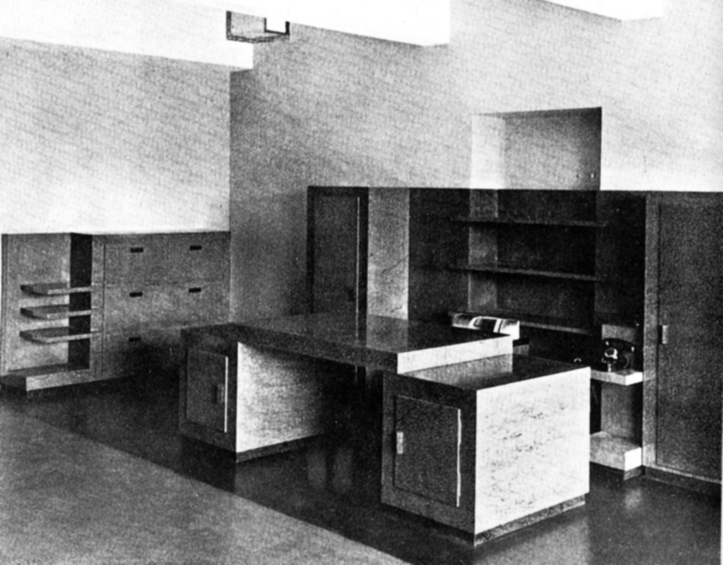
This idea was pursued by Pagano himself in collaboration with the architect Gino Levi Montalcini for the offices (Turin 1928-1930) of the industrialist Riccardo Gualino, which represent one of the earliest integrated projects of space and furnishings for work. The two architects designed not just the building -a rigorous functional volume, projecting slightly in the middle and punctuated by the cuts of the openings- but all the interiors, furniture and objects as well.
An icy uniformity characterized the design of chairs, typewriter stands and desks: they were pieces of furniture anchored to the ground by blunt proportions and with elements juxtaposed with one another, faced with different qualities of buxus. [1] (Fig.1) The furniture of managers’ offices and the boardroom, while accentuating the contrast of full and hollow spaces with glossy horizontal facings (grey-green, black, green and mahogany, in some cases white), did not diverge from the taste that imbued the other settings. Made by the piano manufacturer F.I.P. (Fabbrica Italiana Pianoforti) owned by Gualino, Pagano and Levi Montalcini’s desks aspired to mass production. They were shown at the 4th Monza Triennale (1930) as an expression of ‘modernity, technical perfection and efficiency of production’ (Persico, 1964, p. 150), but were not replicated for other offices. Although the furnishings of Pagano and Levi Montalcini aspire to be democratic, they remain in reality exceptional.
3. The metal office desk
After the experiments with Mannesmann nickel-plated and cold-drawn precision tubes conducted by Mart Stam and Marcel Breuer between 1925 and 1927, metal tubing in Italy became the material that epitomized the ‘idea of modernity’, especially in the world of work. The first mass production of metal furniture for offices was by Olivetti, which in 1930 set up Synthesis, a branch dedicated to this type of product. It put into production a series of filing cabinets (design by Aldo Magnelli), the E1 typewriter desk and a cantilever chair that was derived from Stam and Breuer’s research into the model.
The desk became the most interesting design theme for architects on the occasion of exhibitions and temporary displays. In 1933 Luigi Figini and Gino Pollini showed a convertible professional studio at Il Milione art gallery (Milan): combining the idea of modularity with a metal structure, the result was a desk made of wood coated in grey and shiny black shades of lacquer, plate glass and metal parts in Anticorodal alloy. [2] Then Figini and Pollini won the first prize in the ‘Competition for an Office Desk for a Professional or Manager’ (6th Milan Triennale, 1936) with a desk that had a steel structure and modular parts. The second prize was won by the writing desk designed by students at the Scuole dell’Umanitaria, who made the surfaces and volumes (the lateral container) extend out from the main body of the desk. The contrast of colour (the pear wood tinted black and treated with spirit varnish/the white of the linoleum top and a sliding door) and finish (shiny/matt) helped to make the piece of furniture stand out visually in the space.
These projects experimented with the idea of rule and flexibility, adopting the aesthetics of the new materials and destined for mass production, but in Italy the conditions required to do this on a large scale were still lacking. Metal furniture was recommended for public places, but the material (superior quality steel) and the chrome-plating (which ensured its durability) made its manufacture costly, despite the activity of small and medium-sized industries like Cova in Milan, Emilio Pino in Parabiago, SIAM in Turin and Columbus in Milan, which joined Olivetti Synthesis in the production of office furniture.
Giuseppe Pagano also used metal tubing to represent the aspiration to modernity of the desks for the headquarters of the newspaperIl Popolo d’Italia(Milan 1934), for which he did all the interior design, characterized by expanses of colour and graphic photomontages on the walls, linear furniture and linoleum floors. (FIG.2) It was a clear contradiction with respect to the political ideas promoted by the newspaper, official organ of the Fascist Party, and one which becomes glaring when these offices are compared with Benito Mussolini’s monumental study, the Sala del Mappamondo in Palazzo Venezia (Rome).
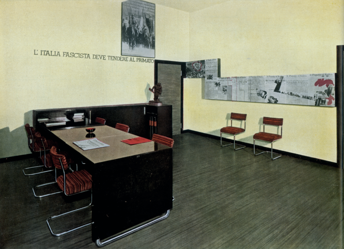
Source:Pagano, G. (1934). Tre stanze al ‘Popolo d’Italia’. Casabella, 13(84), pp. 24-35.
Fig. 2 Giuseppe Pagano, antichambers of the offices of Il Popolo d’Italia, Milan, 1935
4. The office desk as a unit
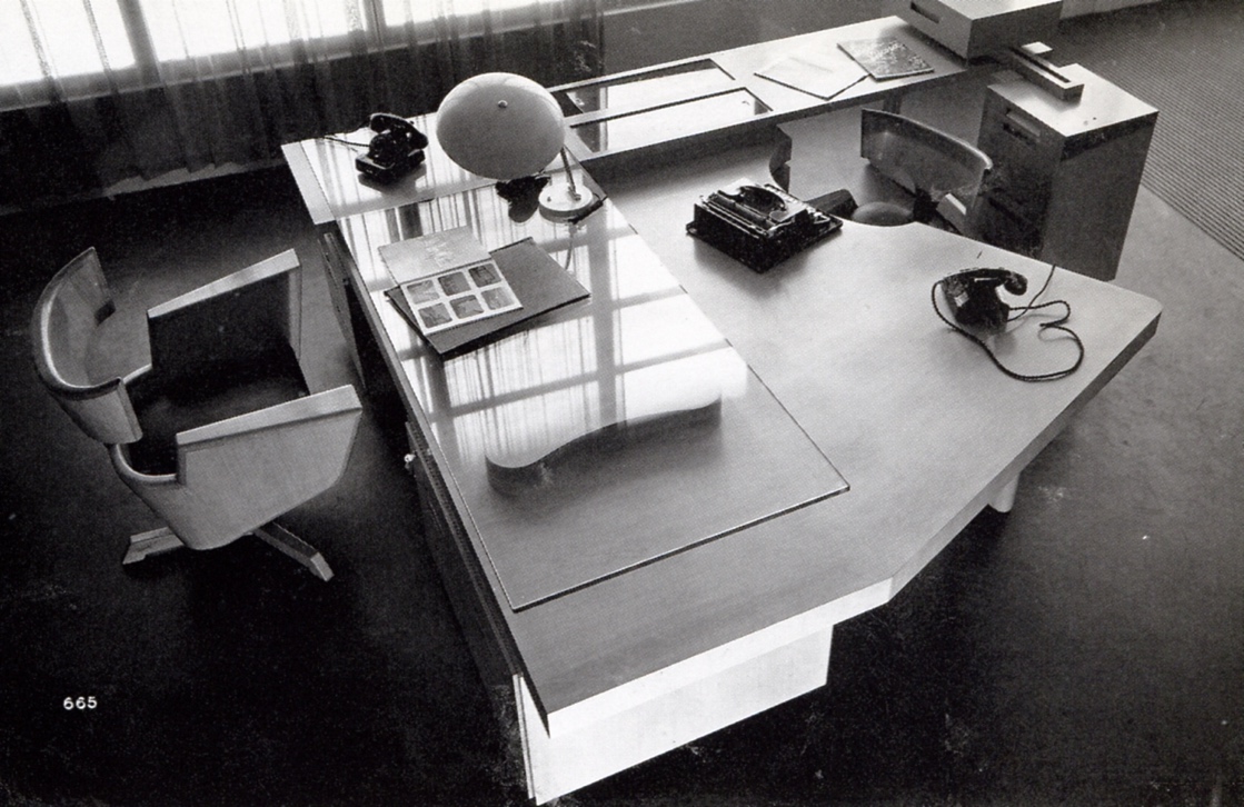
In Milan Gio Ponti, Antonio Fornaroli and Eugenio Soncini’s Montecatini Building (1935-1938) was a complex project of architecture, technology, interior design, furnishing and mass-produced objects in the ‘industrial style’, to which the Montecatini company made an active contribution by stepping up the production of aluminium to be used for the occasion. The design of the building was based on a modular unit, provided by the arrangement of the desks in space or by the workstation (the desk and its surroundings): each worker was assigned a desk, chair, table for the telephone and filing cabinet. The desk was a stylized parallelepiped of sheet metal, with two sets of drawers and a glass top through which it was possible, in the middle, to see the contents of the tray underneath. (FIG.3) The furnishing of the managerial offices was entrusted instead to Gustavo Pulitzer Finali, who marked the difference in status from the employees by means of massive wooden desks, accompanied by armchairs upholstered in leather. Thus the ‘modern style’ proposed by the architects seems to have been destined solely for the office workers, while the managers continued to be represented by more traditional furniture.
Despite the great interest stirred in Italy and abroad by the Montecatini Building, in part for the faith shown by its designers in mass production, Ponti, Fornaroli and Soncini in the same years went on designing ‘exceptional pieces’, made by specialized craftsmen. The sophisticated office for the chairman of the Società Ferrania (Rome 1936) was a sort of geometric trompe-l’oeil that lined the walls of the room and covered the furniture with a kind of ‘sheath’ provided by a wooden inlay, in which the pale colour of the untreated wood contrasted with its black-tinted negative. While narrow stripes had appeared some years earlier on several covers of Domus (the magazine that Ponti had founded in 1928 and still edited), [3] the ‘graphic’ influence of the house for Joséphine Baker (project, 1927-1928), that Adolf Loos had imagined with a facing of alternate stripes of black and white marble, is evident in the Ferrania office.
Moreover in 1939 Gio Ponti designed the furnishings of the Vetrocoke offices (Milan), where the desks utilized plate glass as the main material, since it was made by the company. Although in this project the furniture was industrially produced, it was the specific characterization of the desk that determined its use in that particular space, with the result that the piece was not considered suitable for other kinds of office, as the desks of the Montecatini Building had been.
Different proposals were presented at the ‘Exhibition of the Modern Office’ (7th Milan Triennale, 1940) curated by Renato G. Angeli, Carlo De Carli and Luigi C. Olivieri. Here the three architects showed a ‘central plan’ desk for the director of an advertising agency and his secretary, made out of Slavonian oak and tempered glass. It was a sort of ‘island’ at the centre of the space, designed to involve two people in a close dialogue, face to face. For Angeli, De Carli and Olivieri the desk, ‘instead of being the usual table for papers and the inkwell, becomes the nerve centre of the office, in direct relationship with everything that is the study or work material of the person seated at it’ (Angeli, De Carli & Olivieri, 1940, p. 60). On the other hand, the piece of furniture established a form of hierarchical control, if we note how the top of the desk incorporates the figure of the secretary, seated on a small typist’s chair, while it becomes more linearly free for the director, seated in a comfortable armchair. (Fig.4)
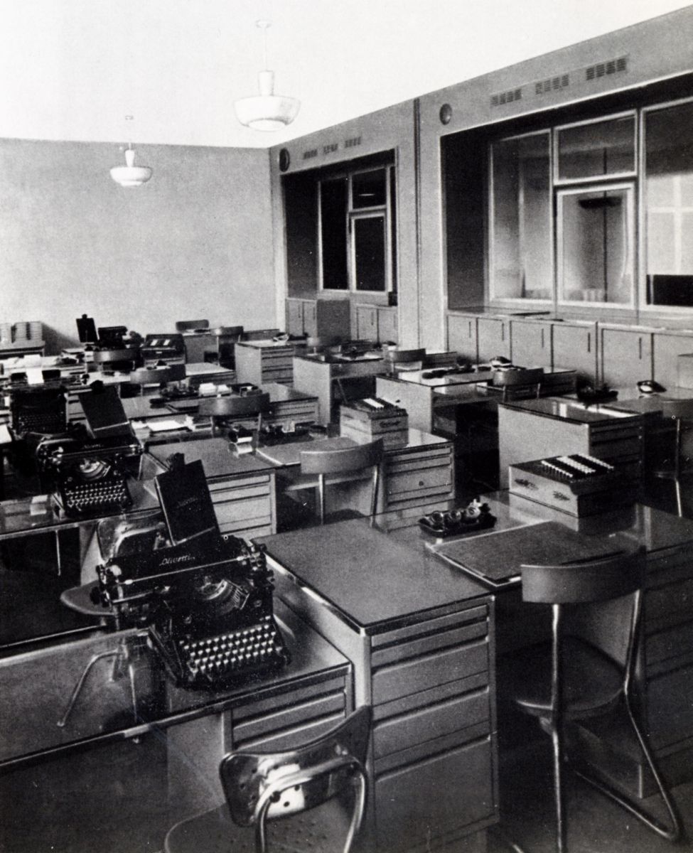
Source: Società Montecatini (1939). Il palazzo per uffici Montecatini a Milano, Milan: Tipografia Pizzi e Pizzio.
Fig. 3 Gio Ponti, Antonio Fornaroli and Eugenio Soncini, Montecatini office building and furniture, Milan, 1935-1938
5. The post-war office desk
In the period immediately after the war ad hoc designs - like Carlo Mollino’s desks for the offices of the Casa Editrice Lattes (Turin 1951-1953) or Gio Ponti’s for the Vembi-Burroughs offices (Turin 1950) - alternated with simpler pieces of furniture produced by industry, such as the PS series of the Centro Studi Castelli (1950)-. In all these cases the furniture was made of wood, with a preference for pale varieties with less grain (ash, pear, chestnut, walnut, cherry), but while Mollino and Ponti hinted at an aerodynamic line, the Castelli firm produced more stereometric models.
The office that Gio Ponti created in Milan in 1949 for Gianni Mazzocchi (publisher of Domus magazine) stemmed instead from experimentation on an element designed for mass production, the pannello-cruscotto [headboard-instrument panel] that the architect would later propose in homes and hotels. It was a fitted backdrop for the desk, equipped with electrically controlled mobile shelves that would present a variety of instruments to the executive (telephone, typewriter, calculator, Dictaphone, lighter). Futuristic forms and traditional materials like solid cherry wood, brass and plate glass also characterized the desk, which had the profile of an aeroplane wing, in which two openings made it possible to view the documents inside the drawers from above. The curved shape of the worktop was due to the desire to turn it when needed into a table for meetings with at least four members of the magazine’s editorial staff. [4]
The office for Mazzocchi sums up the way Ponti thought about offices: ‘After the “hysterics” of the latest expressions of modern furnishing, and the antique horrors that we see at the various furniture shows, it is my hope that we can arrive at a consistent concept of modernity (...) (and) at the spirit of the work which has to be carried out, with precision, simple and limpid ideas, clarity and use of all modern means’ (Ponti, 1948, p. 23).
Standardization of the executive desk was the aim pursued by Osvaldo Borsani’s company Tecno. Its most interesting proposals were tables with plywood tops and a metal framework and drawer units that were cantilevered or had light metal supports (T90 and T49 models, 1954). In particular, the dynamic, boomerang shape of the T96executive desk (1956) was derived from the hexagonal plan of the ENI Building at San Donato Milanese (1956-1957, designed by Marcello Nizzoli and Mario Olivieri) and anticipated an idea of elegant informality, combined with the warmth of wood, apparently out of a desire to lend the office a touch of domesticity.
While Borsani came up with proposals for managers, the BBPR (Lodovico barbiano di Belgiojoso, Enrico Peressutti and Ernesto Nathan Rogers) focused instead on the desk for clerical workers with the Spazio series (Olivetti Synthesis, 1960-1961). This was a set of tables, containers and shelves intended for use by five or six people in spaces of small size, but which could be combined for use in larger spaces. The informing principles were the modularity and combinability of the different parts, thanks to a system of hinges connecting the supporting elements with the containers that made it possible for the furniture to be assembled simply by the users themselves. The basic elements were standardized through the use of pressed and pre-painted sheet metal and steel tubes and bars. Innovations included covering the edges of the desks with rubber (to avoid injuries and to fix the plastic or leather covering); a drawer unit-cum-telephone tray, rotating around the leg of the desk; a lamp fitted onto the worktop; adjustable feet of the vertical supports.
The Spazio series comprised a range of four colours for twenty versions of the desks, adjustable shelves and suspended cabinets that could be chosen to characterize different company settings: ‘We wanted (...) to affirm the possibility of attaining rationally complex results (variability) by means of simple elements in production and in processing. Above all we have drawn on what is one of the advantages of the industrial method: the high degree of precision and uniformity of execution of pieces with minimal margins. The result has turned out not only to be of high quality from the mechanical viewpoint but also valid from that of form’ (Peressutti 1965, 20). (FIG.5).
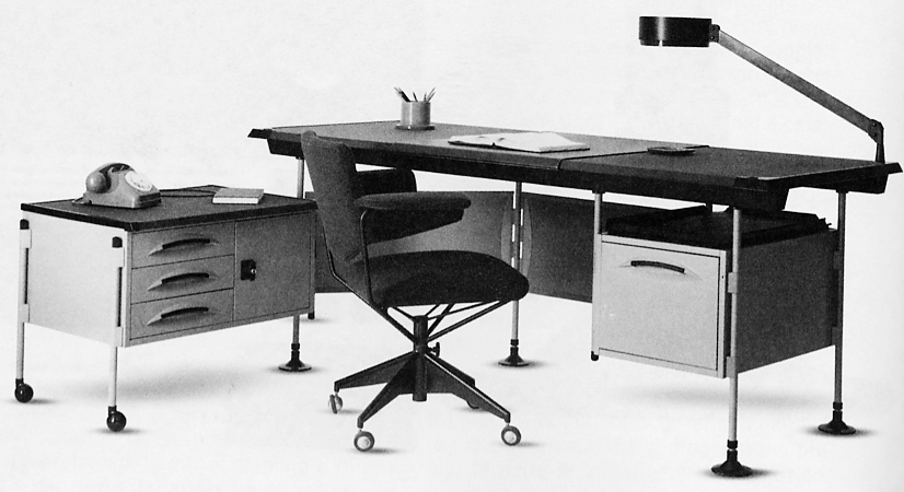
Source: Photo by the author (2020)
Fig. 5 BBPR, Spazio desk, Olivetti Synthesis, 1960-1961, advertising
At the height of the economic boom the modern office skyscraper made its appearance in Italy with Gio Ponti, Antonio Fornaroli and Alberto Rosselli’s Pirelli Tower (Milan, 1956-1961), [5] which became an urban landmark symbolic of the industrial world. On each floor the interior is organized around a central route, tapering at the ends in relation to the flow of personnel, providing access to the cellular offices for executives and the open space for clerical workers and broadening in the area in front of the lifts and bathrooms. Here too, just as in the Montecatini Building, a module determined the centre-to-centre distance of the internal partitions (with glass or covered in Viniltex synthetic leather), on a square grid of 95 cm on a side, given by the size of the desk and the space around it. But Alberto Rosselli’s metal desk was very different from the Montecatini model: it was almost suspended in the air, thanks to the slender vertical supports with tapered feet united by a central bar and the storage unit detached from the desk top, in a dark colour so as not to dazzle. In addition, the same piece of furniture was utilized by office workers and managers, indicating the democratic intentions behind the design.
6. The democratic office desk
At the end of the sixties, the concept of ‘Office Landscaping’ [6] took hold in Italy too, with a consequent demand for more flexible furniture systems in order to give the workplace a more authentic ‘human dimension’ (Forino, 2011, p. 244). Ettore Sottsass set out to develop models that would meet the expectations of users, relying on a sensitive, ethically oriented approach and an aesthetic of ‘Franciscan sensibility’ (Sottsass, 1983, p. 51). So the Synthesis 45 system (Olivetti Synthesis, 1972-1973) [7] was proposed as a ‘flagship series’, democratic because of its affordable price, devoted expressly to clerical workers and able to act as a neutral support for a changing environment: ‘We should not underestimate the fact that Olivetti Synthesis is an Italian industry and that, in those years, it had to deal with the reality of the Italian market: this meant that a system of furniture could work only if it could be turned into a non-system and thus used in interiors of a traditional character (...). In Italy, in reality, it can be said that the office for the clerical worker had never been considered “a setting to be furnished”, but an empty space in which to place the cheapest products possible’ (Sottsass, quoted in De Lucchi, 1983, p. 177) [8].
Synthesis 45 stemmed from a modular grid (of 45 cm, with sub-modules of 15 cm) and comprised different types of furniture, such as desks, small tables, stools, chairs, filing cabinets, acoustic screens and various accessories, including a coat rack-umbrella stand, a telephone tray, flowerpot holder, ashtray and tray for documents. The different types were distinguished by colour: for instance, the filing cabinets were coloured a pale blue to reduce their visual impact and the bookcases brown to convey their ‘traditional’ value. The separating screens were covered with dark brown and slightly padded fabric. The system was completed with tables for calculating machines, with hinged tops that could be folded away when not in use. The desks, which had two simple vertical supports, were a very pale grey colour to reduce the glare of artificial lighting: ‘The idea,’ said Sottsass, ‘was to arrive at a kind of neutral and elementary design, since we considered that only in this way would we be able to exercise control over the general construction of the environment. We thought we had to practise a sort of “yoga” on the project, freeing the form from our conditions of space and time, stripping from it any attribute of sex-appeal or deception. In order to arrive at the design of a system of elements that would fit together naturally on every occasion, without effort, with almost obvious simplicity’ (Sottsass, quoted in Best 1973, 52).
Sottsass created a neutral setting, adaptable to different organizational structures, but one that at the same time was humanized by the funny looking chairs -amusing objects made of canary yellow plastic, with tip-up seats and exaggerated mechanisms, or stackable conference chairs in strawberry red ABS- and small accessories, as well as by the strong and unusual colours. It was in fact one of the first Italian office systems in which coloured plastic was combined with more common place metal. (FIG.6).
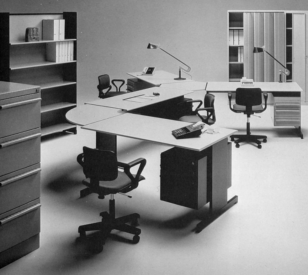
Source: Photo by the author (2020)
Fig. 6 Ettore Sottsass, with Perry A. King, Albert Leclerc, Bruno Scagliola, Tiger Umeda and Jane Young, 45 series desk and office system, Olivetti Synthesis, 1969-1972, advertising
Mario Bellini and Giorgio Origlia’s Pianeta Ufficio series (Marcatrè, 1973-1974) was very different. The system used the desk as the base unit, to which various modules (tops, shelves, drawers, dividing elements) could be added, making it suitable for use by a single person or for meetings of three people, through the insertion of a semicircular top. Together with the vertical elements for partition of the space, the clerical worker’s desk became part of a landscape for work that could also be divided up into cubicles, depending on the degree of privacy required within the office. (FIG.7).
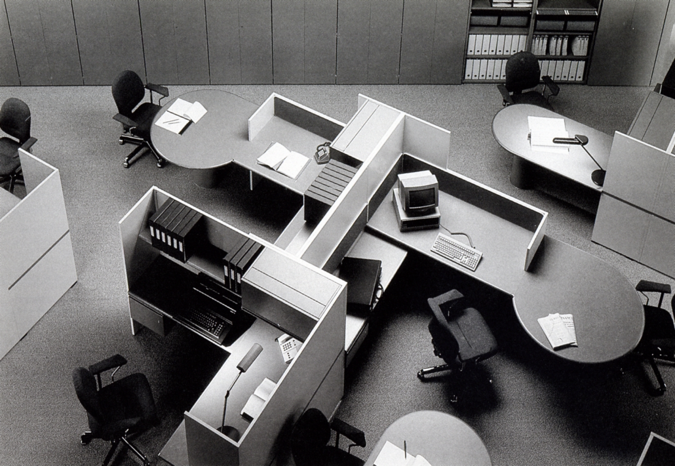
Source: Photo by the author (2020)
Fig. 7 Mario Bellini, Pianeta Ufficio desk and office system, Marcatré, 1973-1974, advertising.
Mario Bellini and Giorgio Origlia’s Pianeta Ufficio series (Marcatrè, 1973-1974) was very different. The system used the desk as the base unit, to which various modules (tops, shelves, drawers, dividing elements) could be added, making it suitable for use by a single person or for meetings of three people, through the insertion of a semicircular top. Together with the vertical elements for partition of the space, the clerical worker’s desk became part of a landscape for work that could also be divided up into cubicles, depending on the degree of privacy required within the office. (FIG.8).
7. The contemporary office desk
Swimming entirely against the general tide of industrial production was the TWBA Chiat/Day office (New York 1994-1995) created by Gaetano Pesce as a one-off work that integrated architecture and furnishings to meet the needs of the client, Jay Chiat, who wanted a fluid workplace, with no individual offices or preassigned desks, in which people could sit wherever they preferred. The office was a large open space, made colourful by the use of resins for the floors and for the specially designed furniture. The individual desk was replaced by small tables arranged as if in a bar or was a small mobile workstation, given more privacy by a screen covered with sound-absorbing felt. Here the users worked on portable computers, withdrawn from central storage together with the necessary papers. Gaetano Pesce created a world of work without hierarchies, where everyone could work freely, without pre-established times or places.
For the Citizen Office- Ideen und Notizen zu Einerneuen Bürowelt travelling exhibition (1993) [9] Andrea Branzi, Michele De Lucchi and Ettore Sottsass were invited to propose their own ideas of the office, focusing on the social changes that underpinned it. While Branzi created an architectural setting for a new version of the solitudo, recalling the lesson of Petrarch (in the book De vita solitaria, 1346-1356), De Lucchi proposed a system for meetings, with groups of small interconnected tables that had attractive tactile and visual qualities. But the most ironic design was the one produced by Sottsass, who reflected on the hierarchical relationships still implicit in the office and tried to deconstruct them through coloured macro-objects: the office supervisor’s desk was a massive black table with a canopy over the top, the clerks’ desks were smaller and a yellow colour with the possibility of fitting low translucent screens, while the receptionist performed her functions at a sky blue table. The arrangement of all the elements in space was only apparently random. In reality it mirrored the balance of power in the workplace.
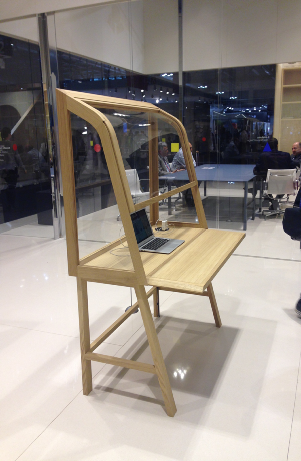
Finally Michele De Lucchi’s Secretello desk (Unifor, 2015) seems to have found a cultural compromise between mass production and the ‘one-off piece’. Although industrially made, it has the figurative elegance of a customized piece of furniture, designed to suit a single person. Moreover it echoes, thanks to the system of closure of the worktop, the writing desks of the past, but here ‒unlike centuries ago‒ the papers cannot really be hidden away, because they are contained in a transparent ‘casket’. This desk represents the synthesis between a culture of long ago and the necessary adaptation to the contemporary world of work which, in part thanks to the adoption of wireless systems, has at its heart a dematerialization - of pieces of paper, of objects, of communications. (FIG.9, FIG.10).
8. Conclusions. A multi-faceted history of (office) design
This brief examination of a number of office desks designed by Italian architects and produced by Italian companies, from the 1930s to the present day, has put some of the cornerstones of equipment design history on the line, not always known to critics and the public. These are furnishings conceived by ingenious artists, often engaged in the same period in the construction of office buildings, of which the desks for employees and managers were an integral part of a global project -from construction to the smallest architectural detail, ending with furnishings-. From the 1960s onwards, with the rise of Italian companies on the international furniture market, desks were instead conceived and produced as part of a 'system' (contract design), in which the architect's creative contribution never fails.
In the design of furniture in Italy, the architect Vittoriano Viganò emphasized the contribution of ‘individual personalities, engaged in an enrichment of the language, in tackling the problems of art in the face of the changing realities of production’ is evident (Viganò, 1961, p. 23). According to him, it was ‘an inevitable, presumably also a realistic choice before a situation that is otherwise growing ever more complex and multifarious, both on the plane of economic and political developments and on that of the need for figurative evolution’ (Viganò, 1961, p. 25).
These reflections are still relevant, if one looks at the history of Italian design as a whole, from the beginning of the twentieth century to the present. The history of furniture design in Italy is in fact complex and cannot be summed up in some artistic movements or schools of thought, developed according to a chronologically linear sequence. It is, instead, often the result of different personalities, who sometimes collaborated on a project, sometimes worked individually, althout they adhered to the demands of production, of the market, of the users. Initially, the production of furniture and desks was entrusted to the expert hands of the craftsmen and, although Italy aspired to an industrialization of furniture for large numbers, the latter was not actually achieved until after the Second World War.
Between rule and exception, between freedom of expression and compliance with the demands of industry, between tradition and experimentation, between ‘mass production’ and the ‘one-off piece’, Italian architects and designers have produced a multi-faced history of design, showing in the case of office design an interest in the values of the workplace and the relations of empathy or power that hold sway in offices: over time the responses they have come up with are never in a single direction, but they often react to the social changes under way, turning them into works of art as well as functional objects.


